Struggling to figure out what to put on your nonprofit website’s homepage? There’s no doubt that the homepage is one of the most important pages on your entire nonprofit website, but it’s also one of the most difficult to tackle.
Because the homepage serves as a “catch all” bucket that’s not particularly specific to any single thing, it’s difficult to know:
- Why someone is looking at this page
- What they would like from your nonprofit
- What information would compel them to take action with you
- How much they already know about your organization
- What they consider relevant, important, and valuable
Of course, some of these questions can be answered (or at least answered based on an educated guess) by setting up your Google Analytics well. But not all of them.
Complicating things further is the fact that you’re so close to your organization. From such an intimate perspective, it can be challenging to see the forest for the trees. And since your homepage is above all a summary of your nonprofit, it’s definitely the forest you want!
The rest of this article will share my recommendations on exactly what to put on your nonprofit homepage—including the most important sections and tons of real-world examples from the best nonprofit websites.
Must-Have Sections for a Nonprofit Website Homepage
There’s no right or wrong answer necessarily, but there are some recommended components to help you explain your organization, make a compelling case for the visitor to take action, and grow your impact online.
The sections we discuss below include:
- Hero
- Mission
- Services
- Problem
- Impact
- Get Involved
- Testimonials
- Logo Cloud
- Resources
- Assorted/Other
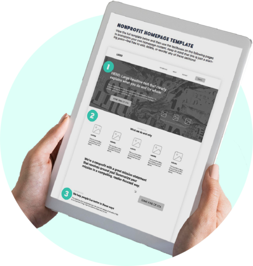
Download the complete nonprofit homepage template
Wondering how to make your nonprofit’s homepage as clear, captivating, and user-friendly as possible? Download our homepage template and interactive PDF with a list of 11 essentials for a nonprofit homepage.
Hero
It has become standard for the “hero” section to include a large photo (or animation/video) in the background, plus a short headline. And this format definitely works! Remember that the goal is to clearly and instantaneously explain to someone who you are and what you do—with the ultimate goal of piquing their interest and keeping them on your website.
For this section, I recommend:
- A short, snappy headline that favors clarity over cleverness
- 1-2 sentences of explanatory text beneath the headline (you can be more clever here if you want!)
- A fairly soft call-to-action, such as joining your newsletter or learning more about your programs
- Something of visual interest that is not too distracting in the background: an image, an animation, a video, or a texture/pattern/motif drawn from your nonprofit logo
As a general rule of thumb for nonprofit website design, I do not recommend using sliders. Studies and web usability tests consistently show that information on carousels/sliders is either missed or actively disregarded by users. (See “Should I Use a Carousel?” for a funny take on this.)
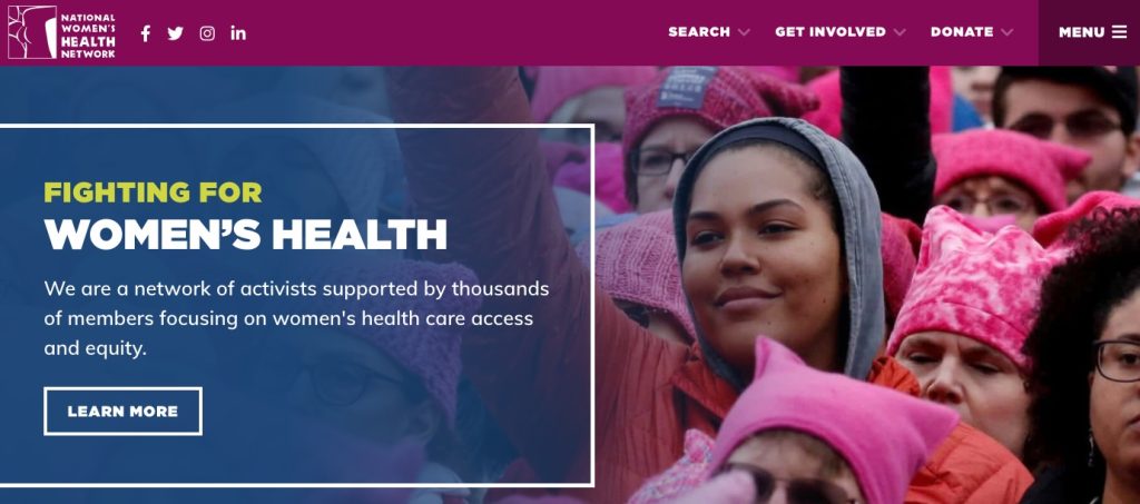
The National Women’s Health Network has all of the above.
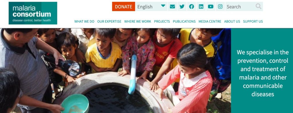
The Malaria Consortium keeps the hero very simple and straightforward.
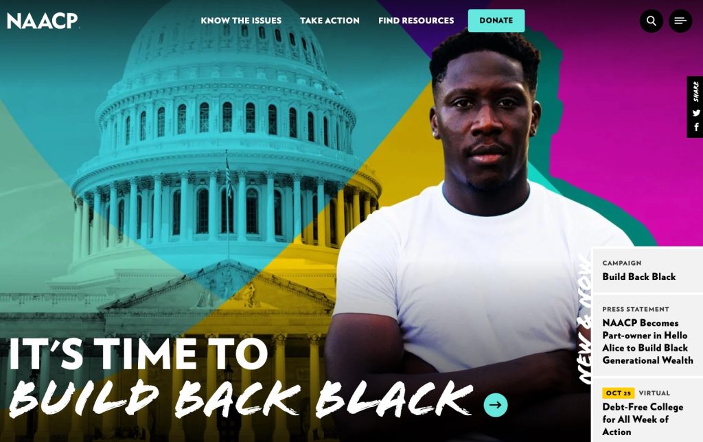
The NAACP uses striking imagery and a simple, clear headline that explains what they do. The “New & Now” links to the right are a unique way of presenting information without detracting from the hero itself.
Mission
The “mission” section does not have to be a recitation of your mission statement, and in most cases, I would urge you not to simply paste the mission statement here.
If you do want to use the mission statement itself, make sure that it’s written in user-friendly, direct language (not boring corporate speak). You may want to supplement the mission statement with additional information presented as icons or images.
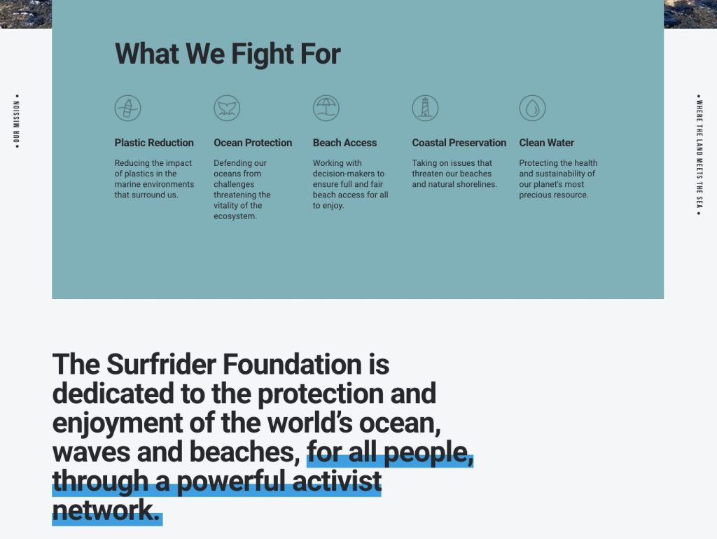
The Surfrider Foundation does an excellent job of summarizing key benefits before stating the mission beneath.
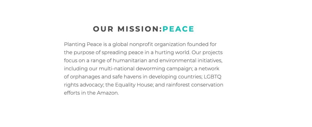
Planting Peace keeps their mission statement bite-sized.
The Roma Foundation puts their mission statement directly in the hero.
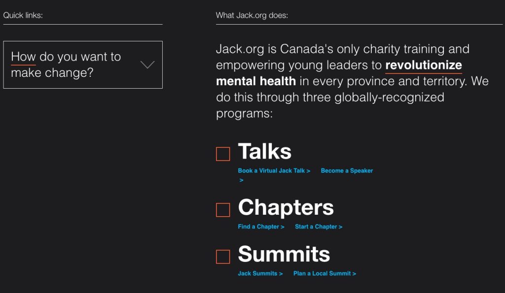
Services
For this section, the goal is to provide a fast, easy-to-scan overview of the services you provide. There is no need to list every single service, and you don’t have to use the actual service title. In fact, I would recommend not using the “official” title unless it’s perfectly clear what the service is.
Ideally, you would also provide a short description of the service so that a user can scan this section and not have to click to another page to find out more.
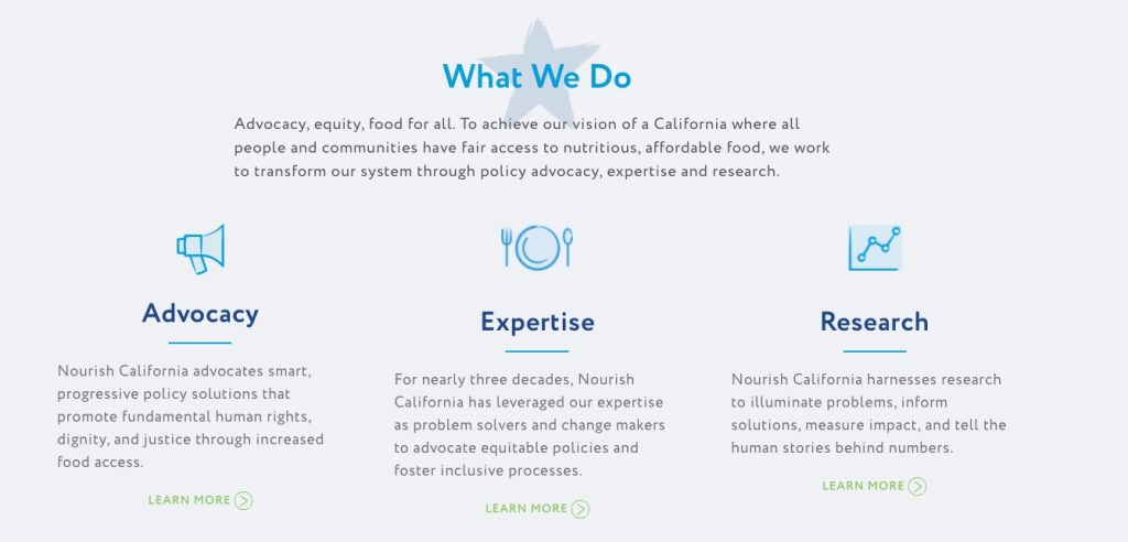
Nourish California combines the mission and services section into the same module.
Parents Helping Parents takes a tried-and-true approach by displaying simple service cards with titles and descriptions.
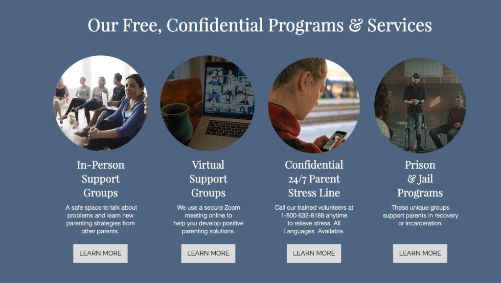
Jack.org takes a slightly less common approach and does a great job of highlighting their key differences and benefits.
Problem
The problem section should explain or agitate the problem, ultimately answering the question “Why does this nonprofit exist?” Depending on what your organization does and your overall messaging approach, you may want to explain the problem in depth, or add just a short sentence or two.
Mentioning the problem is a good way to position yourself as the solution and to make it clear to website visitors why they should support you.
The Annie E. Casey Foundation uses a compelling statistic to showcase the problem.
The Malala Fund takes a similar approach, using an arresting number to get your attention and ask for support.
Share the Struggle’s “problem” section is a bit different, as it’s used to reassure website visitors that, yes, they can help you. (Someone viewing this nonprofit website doesn’t need a statistic; they just need to know they are safe to bring their problems to this organization.)
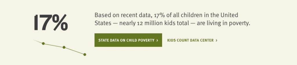
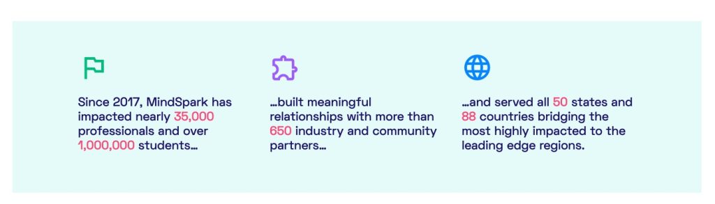
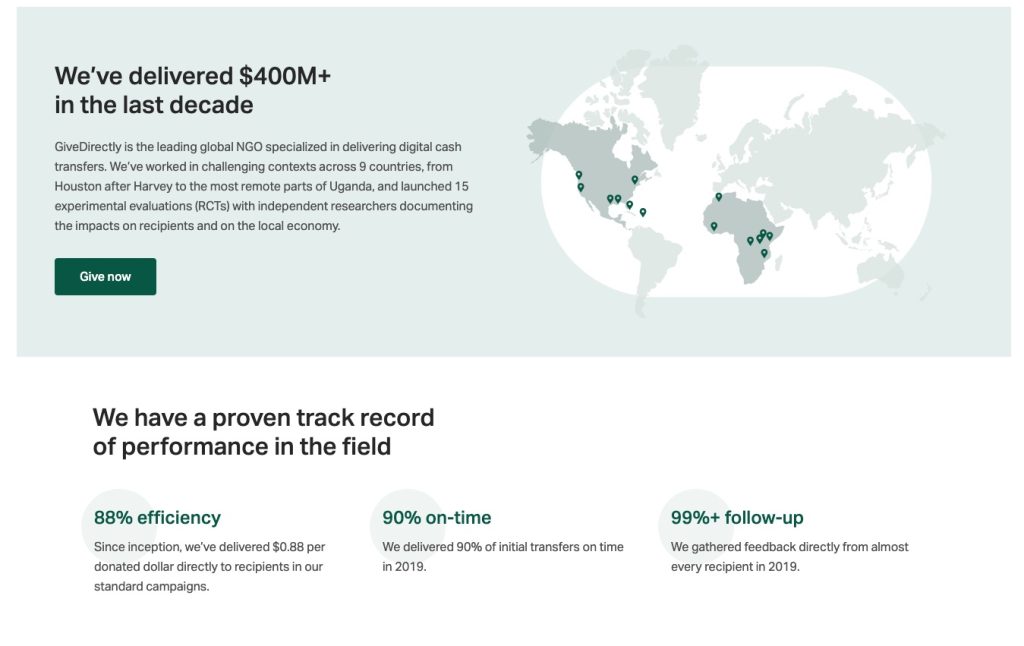
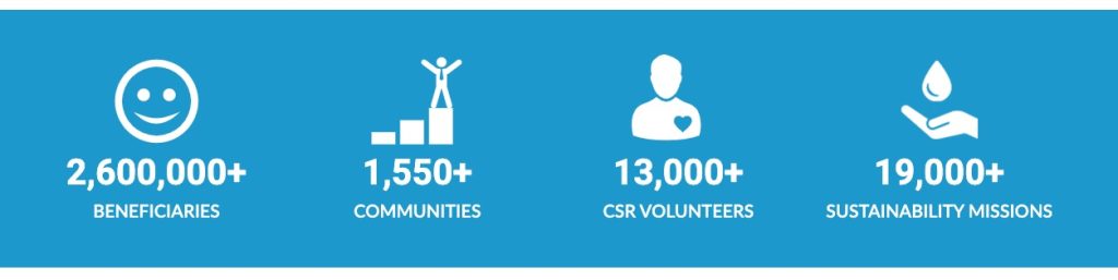
Impact
The purpose of this section is to show quick statistics that prove the good work you’re doing. I particularly like placing this after you’ve brought up the problem, as it positions your organization as an effective solution to those problems.
This section could be as simple as large numbers if they are self-explanatory, or you may want to add a headline and 1-2 sentences per statistic.
MindSpark uses short sentences.
GiveDirectly features a more in-depth stat with a paragraph and then another impact section with a headline, title, and sentence to explain each stat.
Planet Water Foundation uses simple stats with no explanation needed.
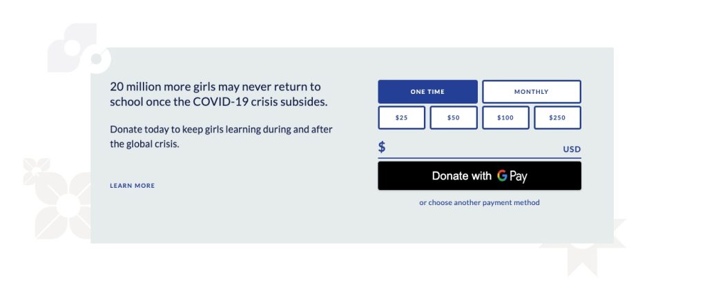
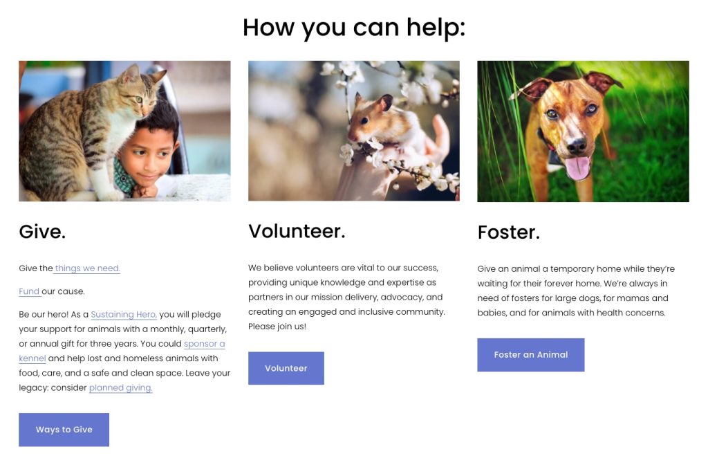
Get Involved
I call this the “Get Involved” module as it typically presents several ways for the website visitor to get involved with your nonprofit. The exact actions you present here will depend on your nonprofit, but frequently this section will include buttons to learn more or even a form to directly join your efforts.
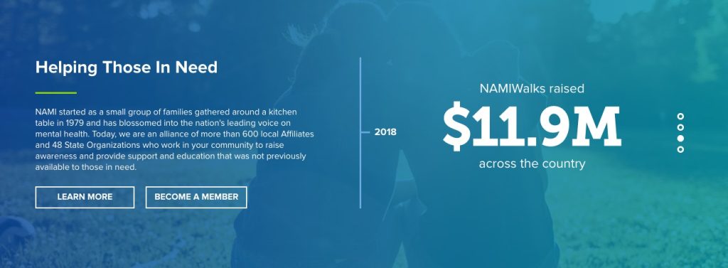
NAMI uses this module to showcase impact statistics (on the right) and to offer two ways to get involved on the left: learn more or become a member.
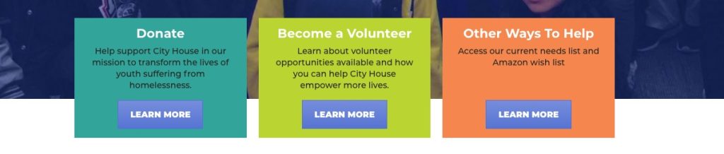
CityHouse uses a series of cards to present three ways to support their organization.
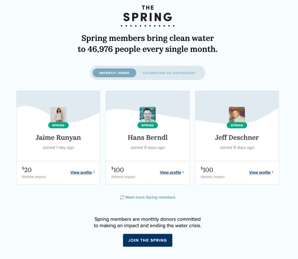
CharityWater uses this section to feature their recurring membership program, The Spring.
Blue Mountain Humane Society takes a more detailed approach, providing paragraphs of text and buttons to learn more.
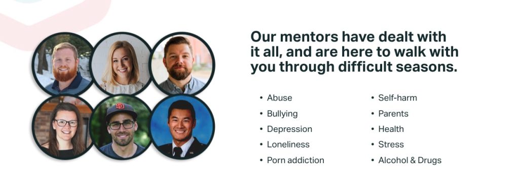
Testimonials
Testimonials are pretty straightforward. You want people who work with you, donate to you, or benefit from your services to explain exactly why you’re so awesome!
Ideally, a testimonial would include:
- A compelling snippet that is not too long
- Quotes or other visual styling to make it easy to tell that this is a testimonial, even upon scanning
- The person’s name
- The person’s relationship to you
- A photo of the person
Depending on how sensitive your nonprofit’s work is, these features may not be possible. And that’s okay! Feel free to change names, use high-quality stock photos, or leave out any piece that is not appropriate to share. (And of course, make sure you have permission and approval from this person.)
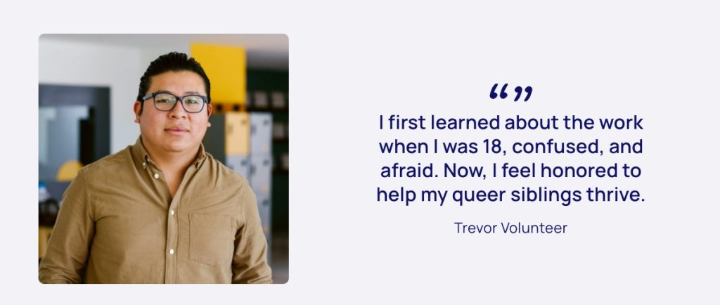
The Trevor Project uses an anonymous name but a photo.
Love146 maintains privacy but still provides many testimonials of people they help.

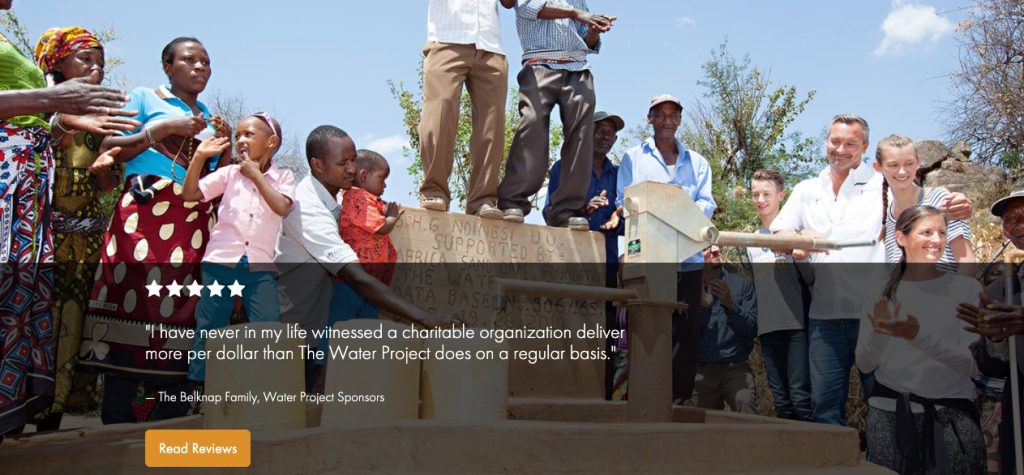
The Water Project uses a testimonial from a donor to drive home the efficacy of their work.
Logo Cloud
Logo clouds are one of the most effective ways to build trust and credibility at a glance. Most users will not look super deeply at the logos—but that’s only because a quick look will be enough to make them see that, yes, you are trustworthy.
This could take many forms:
- As seen in
- Supported by
- Featured on
- Our partners
- Certified _____
- Accredited by
GiveDirectly says “Funded or recommended by.”
Ocean Conservancy uses no headline (and puts this information in the footer).
GiveWell uses “As seen in.”
Resources
If one of the main goals of your nonprofit website is to educate or inform, then sharing resources on your homepage is a great way to do that. Remember, not everyone who comes to your homepage will understand what you do, so providing multiple ways of engaging can help them form a better picture of your mission.
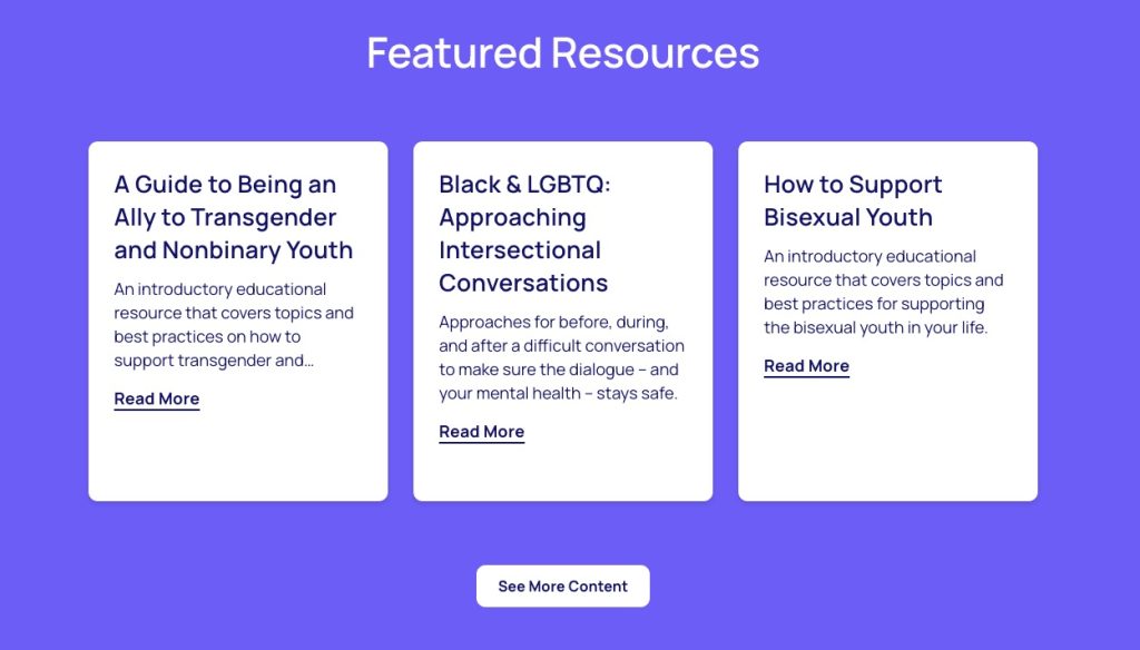
Resources might look like a section for your most recent blog posts (like The Trevor Project)…
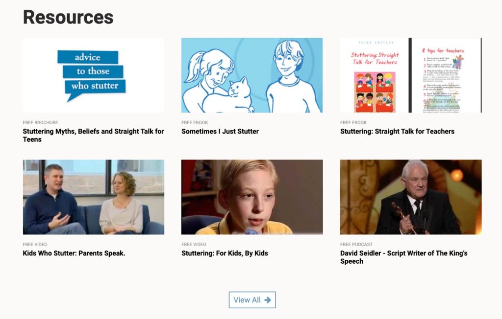
…or some kind of downloadable ebook, video, or podcast (like The Stuttering Foundation).
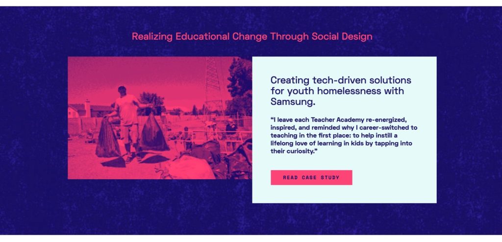
Another interesting approach is a case study (like MindSpark).
Assorted Other Modules
What else might go on the homepage of your nonprofit website? Well, that depends a great deal on what your nonprofit does! Some other modules you might consider are:
- Embedded videos
- Specific donation opportunities
- FAQs
- Shopping/e-commerce
- Client intake form
- Volunteer form
- Donate form
- Lead magnet
- How it works/our process
- Map with list of service areas
- Find a local chapter
- Unique donation options, such as stock/investment
Free Downloadable Nonprofit Homepage Template
To see all of these sections in a nonprofit homepage wireframe, download the free template below.
Download the complete nonprofit homepage template
Wondering how to make your nonprofit’s homepage as clear, captivating, and user-friendly as possible? Download our homepage template and interactive PDF with a list of 11 essentials for a nonprofit homepage.
Tips for Improving Your Nonprofit Website Homepage
1. Assess your current site.
Using the sections and modules listed above, assess your current homepage:
- What are you lacking?
- What sections would help present a more complete view of who you are, what you do, and how/why someone would join you?
- What sections are currently present that do not provide much value?
On paper or on the computer, make an outline of your current homepage. Then compare it to the suggested modules above.
2. Compare your homepage to other nonprofits.
One of the very best ways to get inspiration for your own nonprofit website design or copy is to check out what other nonprofits are doing! Look at your direct competitors (I know—many of us hate the word competition, but it is true) and analyze their homepages:
- What works?
- What doesn’t?
- What can you learn?
You can get more tips by checking out our favorite nonprofit website designs.
Use a browser extension like GoFullPage to take screenshots of entire website pages and download them as PDFs or PNGs. This makes it easy to zoom out and really see structurally what’s on the nonprofit homepage.
3. Ask volunteers to send you their feedback.
Draw on your network of staff, volunteers, board members, etc. to get an idea of how well your homepage is working. Ask questions like:
- How well does this represent our nonprofit’s services?
- How well does this express our mission and deeper “why”?
- Is it clear how you can support us?
- What questions do you have upon viewing this homepage?
- Does any piece of this seem unnecessary or confusing?
- Does the design look professional overall? What is your impression of our credibility?
- Is the website easy to navigate?
If you have the budget, a formal UX test could be very insightful here.
4. Add more stories.
As much as possible, try to weave personal stories into the sections above. The more that you can connect your work to real people, the better!
For example, instead of simply saying “We do X” (like the services section above) or “Our results are Y” (like the impact section above), you could feature a set of client stories that illustrate these points.
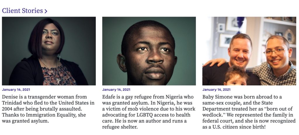
The Immigration Equality nonprofit website does an excellent job of this, showcasing both services and impact through personal storytelling.
CharityWater’s recurring giving program is also great as it highlights individual members. We can see exactly who is in this community.

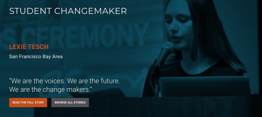
Generation Citizen features the story of a student changemaker, serving as both a testimonial and an inspirational piece.
5. Consider the call-to-action you’re presenting.
Many nonprofits will focus on getting donations throughout the homepage—and this can work. However, for most nonprofits that do not have nationwide/international brand recognition (and do not regularly get donations from random people online), it’s unlikely that a website visitor will come to your homepage and decide to donate.
In this case, you are most likely better off presenting a softer call-to-action, such as:
- Join our newsletter
- Read our nonprofit annual report
- Sign up for more information on volunteering
- Download a case study
- Read our free guides
- Watch our free video resources
- Hear/subscribe to our podcast
These options provide a way to build a trusting relationship, which makes the website visitor more comfortable and more likely to donate over time. At the very least, it’s worth A/B testing the calls-to-action you present on the homepage.
6. Think about unique modules to add.
Refer back to our list of “assorted other modules” above and think about what unique information you could present on your homepage. Adding something special—something directly connected to what you do and what your audience would want to see—will help your homepage feel more interesting and personalized to your nonprofit.
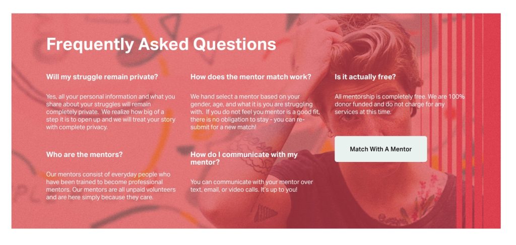
Share the Struggle includes a section for frequently asked questions.
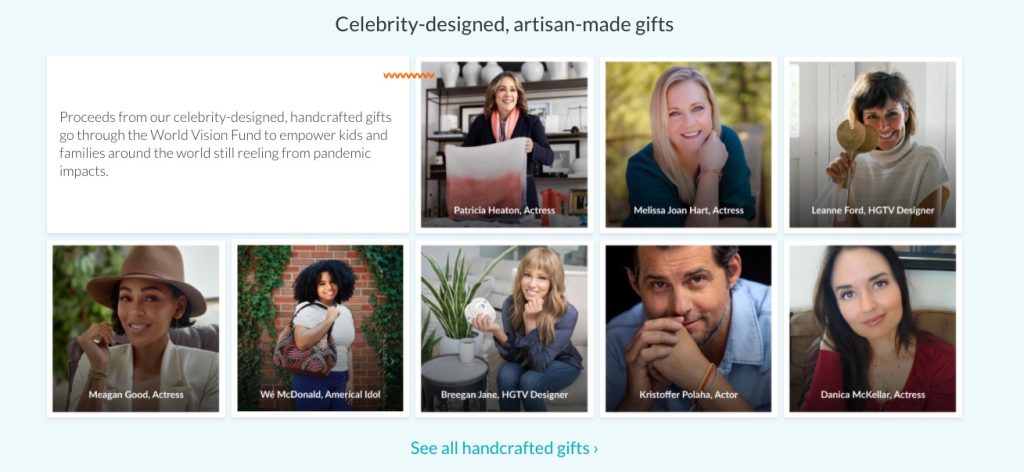
A big part of WorldVision’s approach is handmade gifts, so they’ve put an ecommerce section right beneath the hero on the homepage.
The Stuttering Foundation has an interesting section about People Who Stutter. For an organization that seeks to provide support and eliminate stigma, this is an excellent and unique thing to include.

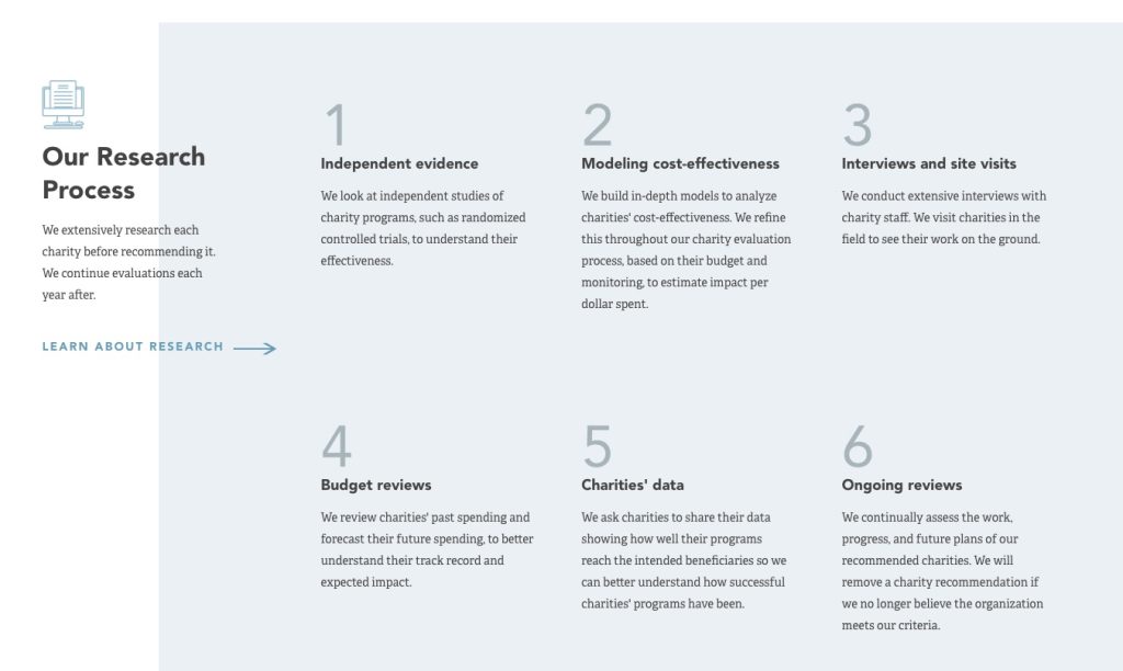
GiveWell ranks nonprofits based on in-depth research. To build trust and explain their process to website visitors, they’ve included a section for Our Research Process.
7. Create visual interest.
For each of the sections above, try to focus on a balance of communication methods, such as:
- Headlines
- Paragraph text
- Photos
- Icons
- Cards
- Infographics
- Animations
- Illustrations
Switching up how you present information is key to making your page easy to understand, easy to scan, and visually attractive. For example, you might have a large text headline in one section, followed by a section with a photograph and paragraph text, followed by an infographic or illustration.
Download the complete nonprofit homepage template
Wondering how to make your nonprofit’s homepage as clear, captivating, and user-friendly as possible? Download our homepage template and interactive PDF with a list of 11 essentials for a nonprofit homepage.
8. Experiment!
There is no foolproof way to get “the best” nonprofit website or “the best” nonprofit homepage. What works for one organization may completely fail for another, especially since no two audiences, missions, or programmatic structures are exactly alike.
Ultimately, the best way to start improving your nonprofit website is refer to the best practices above and then experiment with individual components. Measure your baseline performance, make targeted changes, and then check if and how your desired metrics have changed.