Your visitor’s journey is one of the most pivotal considerations on your entire nonprofit website, and central to that journey is your website’s navigation menu.
After all, your site’s navigation menu is:
- How your visitors orient themselves on your website
- How they move from page to page
- How they discover new content
- How they understand what you do and how you do it
- How they decide whether they’ll stick around to learn more—or not!
But organizing your website’s navigation menu can be tricky.
What pages should you include? How many? And how should you structure them?
It’s kind of like sorting a deck of cards — there are a seemingly limitless number of ways to order the cards, but only one or two ways that truly work, both for your impact organization and your site visitors.
Luckily, you can improve your nonprofit website navigation structure by following some key guidelines and best practices, which we’ve outlined for you below.
Follow these core principles to create a nonprofit website navigation that supports and empowers visitors as they traverse your site—and as they ultimately decide whether or not they want to continue engaging with you and your cause.
1. Include 7 Items Max in Your Menu’s Top Level
It can be tempting to add all your pages to your nonprofit website navigation menu.
You wouldn’t have created it as a page on your site if it wasn’t important, right? But this sort of thinking often leads to some bad practices that can overwhelm your website visitors.
Too many options will create “analysis paralysis” for your visitors. If they have to read through a novel to find the pages they’re interested in, they’ll likely hit the back button.
You’ll need to determine some boundaries for which pages you should place in your nav menu, and which you shouldn’t.
To make this decision, first keep in mind that most navigation menus include multiple levels. When the website first loads, you’ll see several items presented in the nav bar—usually pages like About, Programs, Contact, and Donate.
Here’s an example of a basic but effective navigation bar from VIPS.

Knowing that there can be multiple levels to your nonprofit website nav, the pages on the top-most level should be only the most important. You’ll want these menu items to be the most critical, foundational, and frequently visited pages of your site.
But how many should you include?
Studies show that anywhere between 2 to 7 top-level menu items works best for site visitors.
More than that, and your visitors can find reading through everything a chore. They’ll be less likely to use your nav, as it’s too much work to try and read through all the available options.
Action Item
Check your nonprofit website’s navigation menu. How many items does it contain in the top-most level? If it has seven or more, consider removing the ones that are less important.
2. Keep Your Dropdowns Shallow, 1 or 2 Levels Max
Beyond the top-level navigation menu items, it’s common to include a menu of sub-level pages nested underneath. When a website visitor hovers the mouse over your navigation menu, these nav items will appear in a dropdown menu.
You’re almost certainly familiar with this idea, but here’s an example from the nonprofit organization APEN.
The items in these dropdown menus aren’t usually visited as often (and aren’t as important in terms of navigating your site), but they are still significant enough to warrant adding them into a dropdown within the main navigation bar.
It’s even possible to do a second-level of dropdowns. In theory, you could even do several levels of dropdowns within dropdowns within dropdowns.
New Visions for Public Schools, for example, has two levels of dropdown menus. First you hover over “Schools,” and then each item under “Charter Schools” is in fact its own clickable link.
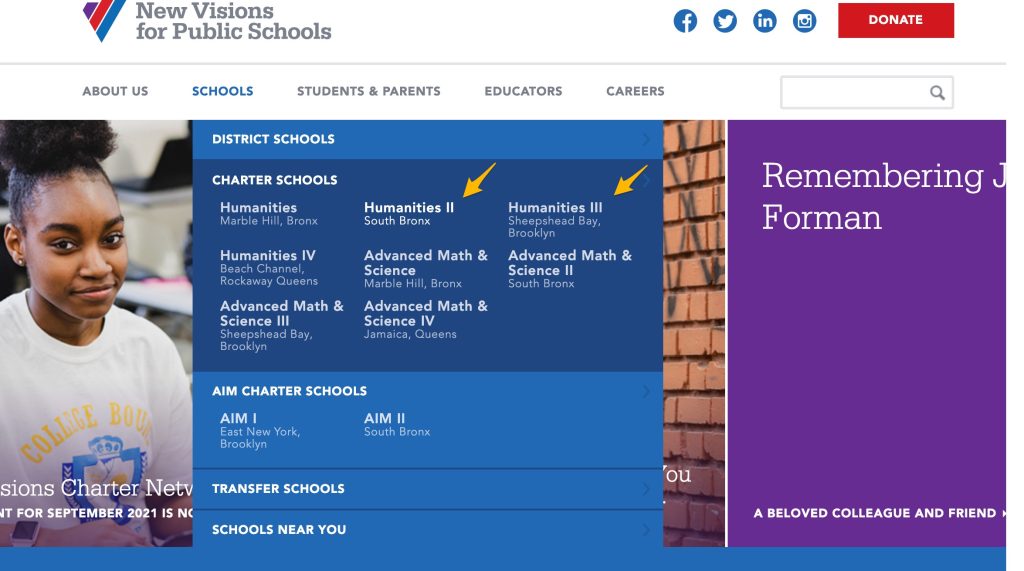
For the New Visions website specifically, the nav menu is clearly organized enough that it’s easy to understand, even with two levels of dropdown menus. However, in many cases, too many dropdown menus can overwhelm your visitors. Rather than trying to read through all your dropdowns, they’ll likely just look elsewhere to get where they need to go.
Keep in mind as well as that if the dropdown menus are activated by hovering, the simple act of trying to use the nav bar can be extremely frustrating. Either you’re accidentally hovering and opening dropdowns, or you can’t figure out how to hover in the right spot to open the dropdown you want.
Not a great user experience, right?
For most nonprofits (beyond those that work in a very technical field), it’s best to stick with a single-level of dropdowns.
This structure gives you more space than having top-level menu items alone, without introducing unnecessary clutter. If you’re a large organization with many divisions, then two levels might make sense.
Any dropdowns beyond that are almost always too much.
Action Item
How many levels of dropdown does your nonprofit website navigation contain? If more than one, think about removing the extra levels and reorganizing into a simpler structure so that users can easily scan and understand.
3. Add a Call-to-Action Button to the Upper Right
According to eyetracking research done by the Nielsen Norman Group, visitors scan websites in an “F” shape. They start in the upper left-hand corner, move to the upper right-hand corner, and then mostly stick to the left side of the page as they scroll down.

This observation means that the upper left and upper right corners of your website are prime real estate. The upper left corner should contain your logo, but what about the upper right?
Well, the upper right-hand corner is an excellent location for your primary call-to-action button.
This button should link visitors somewhere you’d like them to go. Including this button in your nonprofit nav bar—and in this particular location—will dramatically increase the likelihood of a visitor taking that next step with your organization.
Which CTA to Include in the Nav?
Ask yourself: if there’s only one thing your website visitors could do on your site, what would you want it to be? For many organizations, that would be something like:
- Donate
- Join our newsletter
- Sign up to volunteer
- Become a member
- Sponsor an event, child, fundraiser, etc.
Design-wise, this button should use a vibrant color that “pops” and draws your visitor’s eye.
Take the CTA button from the National Center for Learning Disabilities as a good example—it’s literally unmissable!

If you have multiple key actions that your visitors could take, then you could include a secondary call-to-action button as well. This secondary button should be in a more muted color (usually white, grey, or transparent)—and definitely not the same color as your primary button.
Take Stock in Children, for instance, has three buttons in the nav bar, but only one has the vibrant, eye-catching color. (To simplify this even further, we’d recommend changing the logins from buttons to simple text links with less visual prominence.)

Action Item
Does your nonprofit website incorporate a call-to-action button in the navigation? If not, consider adding one to the upper right-hand corner, using a bright color and clear wording.
4. Do Not Include Your Home Page
Generally speaking for any nonprofit website navigation menu, the fewer the items, the better.
One item that you can certainly remove is a link that says “Home.”
The reason for this is that it’s now standard practice for your organization’s logo to link back to your Home page. Visitors of nearly all ages expect the logo to be a link to the Home page.
If you can remove any menu items without negatively impacting your visitor experience, it’s almost always a good idea to do it.
CISA is a great example of a nonprofit nav bar that could be uncluttered by removing the “Home” link.
This organization does awesome work for local food producers and makes use of a utility nav bar (which we’ll cover in point #7 below)—but we really don’t need another item for “Home” when the logo is already so prominent and links to the homepage.
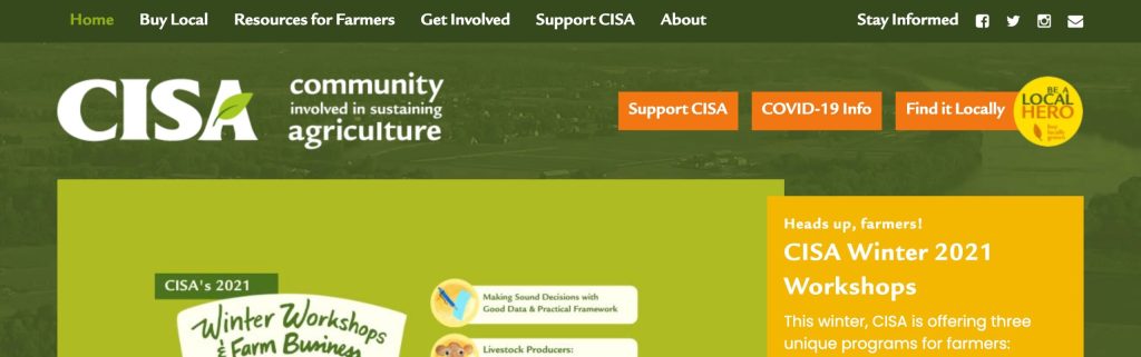
While we’re at it, another item that could be removed from the CISA nav bar is “Stay Informed” at the upper right. A bit confusingly, this is not a link—it’s just a plain-text label. Since people already understand what social media icons do, there’s just no need for this label.
To keep your navigation simple, make sure every item is a link and all unnecessary clutter is removed.
Action Item
Are you listing Home as an option in your nonprofit website navigation menu? If so, consider removing it and linking from the logo instead.
5. Use Consistent Phrasing
There are several ways that you can title the items in your nonprofit’s site navigation menu, but however you do it, try to ensure consistency. This includes consistency in:
- Tone and style: Your nav items are a group and should sound like they go together. Try reading them out loud—do they make sense together?
- Focus: Who are you talking to? Is your language “we”-focused, “you”-focused, or impartial?
To show you what we mean, here’s an example of a nonprofit nav bar that could use a bit of polishing in terms of tone, style, and focus.
Liberty Hill clearly does fantastic work, and their website has a cohesive color scheme with cool illustrations and tons of great information. (They’re also a four-star charity on Charity Navigator, so we know their work is reputable.) However, their nonprofit website navigation could be a bit more consistent to help visitors really understand what the navigation options mean and where they can go on the website.
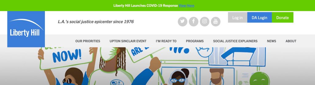
For example, the “Our” of “Our Priorities” refers to the nonprofit, while the “I’m” in “I’m Ready to” is supposed to refer to me (as the website visitor). If I want basic information about their work, I’m also not sure which of these areas would give me the best information: priorities, explainers, news, or about?
How to Ensure Consistency in Nav Bar Wording
For example, here are a few different approaches you could take to help keep your nav menu’s phrasing and focus consistent:
- Object-Based: About, Programs, Volunteer, News, Contact, Donate
- Organization-Focused: About Us, Our Programs, Volunteer, Our News, Contact Us, Support Us
- Alternate Organization-Focused: Who We Are, How We Help, Get Involved, News, Contact Us, Donate
- Action-Based: About, Understand, Apply, Learn, Contact, Donate
- Audience-Based: About, Students, Volunteers, News, Contact, Supporters
For further reading, HubSpot offers a useful overview of how to phrase your navigation items.
If you don’t have a preference for how you phrase your nonprofit’s site navigation items, pick the simplest ones like About, Programs, Volunteer, etc.
Examples of Nonprofit Website Nav Bar Phrasing
Global Kids is a good example of a simple, organization-focused nav bar. Notice how they stick primarily with the “we” and “our,” keeping the phrases short and easy to understand. (The smaller utility nav at the top‚ with the social media links, also helps to keep the main nav less cluttered. We’ll discuss utility nav bars in tip #7!)

You can also go for a combined nav menu approach, like The Boston Foundation has done.
Notice how at the left-hand side, they’ve used an organization-focused approach (Who We Are, What We Do, etc.), and at the right, they’ve used an audience-based approach (Donors, Advisors, Nonprofits).
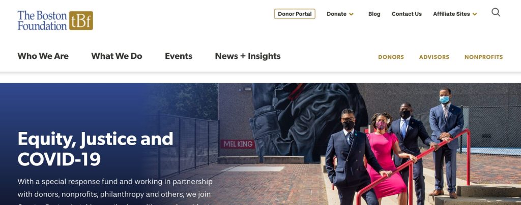
If you do take a more complex approach, then make sure you keep the nav bar well spaced and clear, as The Boston Foundation has done.
When in doubt, go for simplicity. The simpler you can make your website, the easier it will be for your visitors to understand and the more likely they will engage.
Another key tip that goes with simplicity? Avoid internal jargon. You can certainly use your own preferred terms for your programs, beneficiaries, membership levels, etc.—but in the primary navigation of your nonprofit website, you should stick with a term that anyone can understand.
Action Item
Do your nav menu items use a consistent tone and voice? If not, consider revising them so that their styles match. The more clear and consistent they are, the better!
6. Limit the Number of Clicks
Common “website wisdom” once maintained that any action you want a visitor to perform should be possible within three clicks or less from your Home page. This idea led to nonprofit organizations cramming their navigation menus (and page content) with as many links as possible.
However, current research shows that the “3-click rule” is an oversimplification.
The assertion of three and only three clicks has largely been disproven. However, there’s still a kernel of truth in there! The core idea is that your visitors should be able to find the content they need as quickly as possible.
Instead of focusing on the arbitrary number of three, think about it like this: “How will visitors engage with my website navigation?”
When trying to limit the overall number of clicks, consider the role your navigation plays in the context of the organization of your entire nonprofit website. Does the nav menu clearly point the way?
Example of an Overly Complicated Journey Map
For example, let’s say that one of the primary actions you’d like your visitors to take is to sign up for one of your nonprofit’s programs. Here’s one possible journey map that’s not so well planned.

Step by step, here’s what might be happening in the image above:
- The user goes to the homepage and clicks “Programs” from the nonprofit website nav bar. Seems promising!
- The Programs page is jam-packed with links, pictures, and text…but it’s poorly organized and hard to understand what is what. The dropdown menu for Programs has a lot of options, too, but nothing that specifically says what they’re looking for. The user thinks maybe another page would be clearer and clicks over to a page for “Our Work.”
- The “Our Work” page talks about the nonprofit’s general mission and goals…but has nothing about specific work done or programs offered. The user looks again at the dropdown menu under “Programs” but decides to click back to Home.
- The user looks around the homepage, scrolls down, and sees a section with information on programs. They find the specific program they want and click the link.
- From the individual program page, there’s a button to Apply.
- Now the user can fill out the application page.
As you can see, this journey map took 6 steps and a whole lot of confusion.
You might be thinking, “Well, why didn’t the user just look at the home page first?” That’s because many users just don’t! From a user’s perspective, it always seems more efficient to use the navigation menu rather than poke around aimlessly. (And it should be more efficient.)
Your nonprofit homepage might look awesome, but keep in mind that many people would rather get straight to what they’re looking for. Once they know where to go, they may come back to browse the additional information—but they shouldn’t have to sort through all the info first just to figure out where to go.
Example of a Simplified Journey Map
Contrast the example above with this hypothetical nonprofit website.

Here’s what might be happening here:
- The user goes to the homepage and clicks “Programs” from nav bar. Seems promising!
- The Programs page is clearly laid out and offers several ways for the user to engage. They can click on any program to learn more about it (navigating to the individual program page), or they can click a button to apply right away, directly from this overview page. The user wants to apply, so they click apply.
- Now the user can fill out the application page and submit it.
This set-up took half as many steps as the first one while still providing the same information. The main difference is that more attention was paid to where the user wants to go and how to get them there—starting with the nonprofit website’s main navigation bar and then continuing with the content on the pages themselves.
You could simplify the second image flow further by placing key programs into a dropdown under your Programs page in your main navigation bar.
The bottom line?
You want to ensure your navigation menu supports your visitor’s goals rather than including random pages that are ignored at best and that cause confusion or frustration at worst.
Action Item
How many clicks does it take a site visitor to accomplish an action you’d like them to take on your nonprofit website? If they have to navigate to several locations to do it (or there aren’t clear, supportive links on each page to direct them), consider simplifying the process by editing your navigation bar and/or adding clearer buttons and links on the pages.
7. Use Utility Navigation When Appropriate
You might be thinking, “This all sounds great, but I have important links I need to feature beyond my basic pages. Where can I display links to our social media, our member login, or staff login?”
Great question!
One useful solution is to add what’s known as a “utility navigation” to your site’s header area.
A utility navigation can take several forms but is often an extra bar that appears above your regular, primary navigation. It’s usually reasonably short, contains smaller text, and might be in an eye-catching color.
The utility nav is an excellent place to put some of the links and information that don’t fit in the primary navigation menu of your nonprofit website.
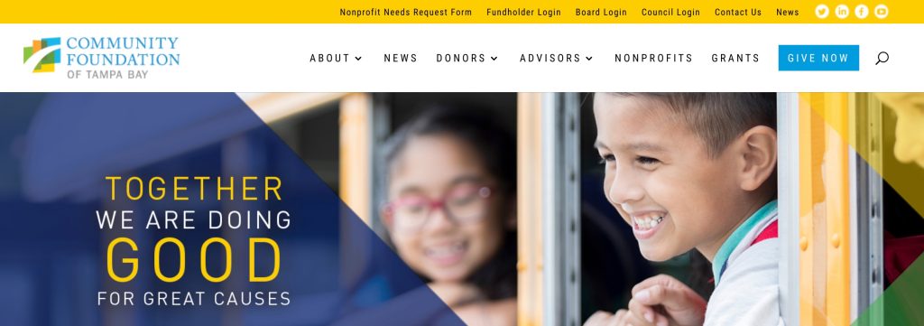
Example of Utility Nav Bars for Nonprofit Websites
Take the Community Foundation of Tampa Bay as a terrific example of a utility navigation bar in a nonprofit site.
As shown below, the yellow utility bar is used to display links to social media, logins for various stakeholders, and the Contact Us page (which is smartly placed there so that “Give Now” remains the most obvious call to action in the primary nav bar).
Besides other valuable but not-quite-as-important links, the utility navigation menu can also contain announcements with links to more information.
Free Spirit Media, for example, uses a utility nav bar with a yellow alert bar to call attention to their COVID-19 response. (Some of the rest of the nav bar could definitely use some simplification, though!)

Incorporating a utility navigation provides extra space to include information that is critical to your nonprofit organization but perhaps isn’t quite significant enough to warrant expanding your main navigation bar.
Action Item
Could your nonprofit website benefit from a utility nav for extra information, social media links, or member logins? If so, consider adding one above your standard navigation menu area. Be sure to choose a color that contrasts enough with your regular navigation bar.
8. Order Your Top-Level Nav Menu Items Appropriately
Once you know which pages you’ll include in your nonprofit website navigation, it’s time to decide which order to display them in the top-most level.
Take the example below from Overtown Youth Center. If this were your nonprofit website, how would you order these items? Why do you think they’re placed in this order?

Thinking back to that “F” shape we talked about in an earlier section…
The locations most likely to be clicked in your navigation are the items on the furthest left and right. Since your visitors likely read left-to-right, the left-most item will be the first menu item they see when looking at your navigation.
Left-Most Nav Item
Many organizations use the left-most menu item to link to the About page, but it can be any page you think is most valuable to your visitors. Other possible options include:
- Programs
- Services
- Upcoming Events
Which page would you direct your visitors to if you could only choose one?
Right-Most Item
As for your right-most menu item, this is commonly used for the Contact page (or for some other “get involved” or “get in touch” type of page). This location is where your visitors will expect to see this kind of information and has become fairly standardized across the web.
Of course, if you include a call-to-action button like we talked about above, this would appear to the right of your Contact page.
Your call-to-action button (if you have one) should almost always be the right-most item in your nonprofit website navigation menu.
Center Items
Once you’ve identified your left-most and right-most items, you can fill in your remaining top-level items in order of importance, going from left to right.
Pretend like you can only insert one more page into your navigation. Which page would you choose? This process will help you determine which pages are most central to your organization.
Action Item
Decide the order of your nonprofit site navigation menu by starting with your most important page on the furthest left and your Contact page on the furthest right. Fill in any remaining pages (after your most important page) in order from left to right.
Wrapping Up Your Nonprofit Navigation Menu
Your nonprofit website’s navigation menu is the central pillar through which your site visitors discover your content.
It’s the glue that holds everything together.
It’s important to refine the navigation experience so that your visitors can find what they are looking for and will continue to engage with your organization. As with the rest of your online presence, a little strategy goes a long way for your nonprofit’s nav menu!
Hopefully this article has provided you with several fairly simple tweaks you can use to improve your site’s navigation. Even if you only incorporate a few of these tips, your visitors will find it much easier to interact with your organization online—whether they’re donors, funders, volunteers, or beneficiaries.