Visual design is just one aspect of a strong nonprofit brand—but it’s an important one! Without the right visual communication strategy, even the most polished elevator pitch, the most cause-driven mission, or the most dedicated staff won’t make the impact you’re setting out to.
But what exactly goes into “good” visual design? What separates so-so brand expression from something more memorable? And what can you do to improve your nonprofit website design?
That’s exactly what we’re covering below—so put on your art director hat and let’s get going!
Harlem Children’s Zone
Overall brand impression: friendly, vibrant, hopeful, youthful
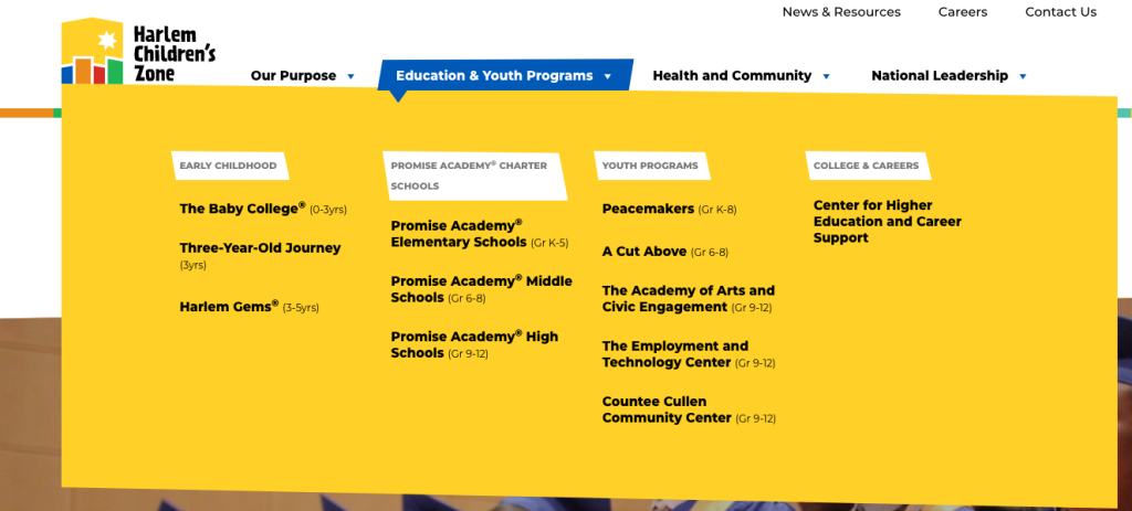
Harlem Children’s Zone is an example of amazing graphic design for nonprofit organizations. Many of the things I love about this website are exemplified in the screenshot above (which is taken mid-way down the home page):
- Bright, eye-catching color palette drawn directly from their logo
- Playful geometric design elements made from uneven shapes—check out the button, the yellow background element, and the yellow shape behind the icon “Education & Youth Programs”
- Custom illustrations of animals, mirroring the geometric collage-style motif
Even the nav menu dropdown (below) is fun and continues the geometric motif! When hovering, it creates an almost speech-bubble effect that works well with the overall brand identity. (Can’t you almost hear an adorable little kid yelling out something out of sheer excitement and joy?!)
What makes this one of the best nonprofit website design examples?
All of the design elements work together to embody a youthful, child-like, and active vibe. With such a cohesive and vibrant design, it’s impossible to feel like the future is anything but bright!
If I was looking for one area for easy improvement, I would probably change the font. Montserrat is quickly becoming one of the most overused fonts on the internet, and it’s lost a lot of its personality just through sheer overexposure.
Want some DIY, do-it-right-now nonprofit website improvement instead?
Download our free guide to the 54 most common nonprofit website mistakes. Inside, we cover why each problem matters and how you can fix things yourself.
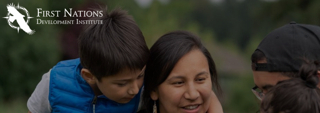
First Nations Development Institute
Overall brand impression: balanced, professional, clean and simple
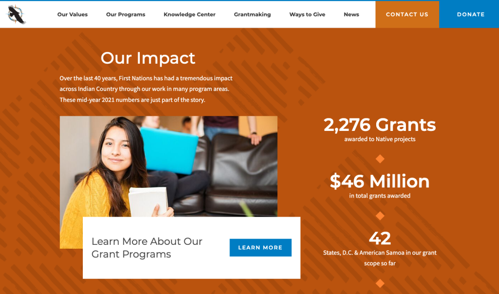
First Nations Development Institute takes a much more understated approach compared to Harlem Children’s Zone, but it definitely works. Unsurprisingly, this website has a much more “all ages” feel (since it’s not a youth-focused organization), and it has a primarily two-color palette of burnt orange and dark sky blue.
Along with the simply and well-balanced color palette, I love the:
- Use of diamonds as a design element
- Geometric, lightly textured pattern (seen in the background of the screenshot above and repeated throughout the site)
- Gorgeous use of photos of street art, murals, and mosaics
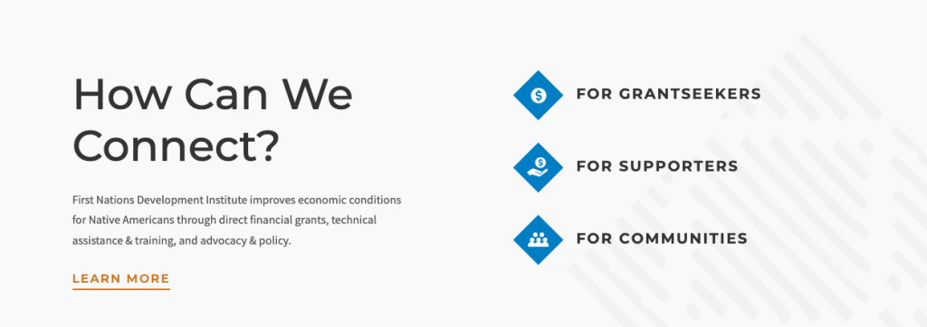
As shown in the screenshot below, they also have a clear path mapped for their three different audiences: grantseekers, supporters, and communities. This can be a great way to help people know what to do on your website.
What makes this one of the best nonprofit website design examples?
This nonprofit website keeps it fairly simple overall, with a solid and well-designed look that feels professional and dependable but does not necessarily make a huge statement personality-wise. This is a good example to follow if you want something that’s polished, understated, and solid.
If I had to nitpick anything, it would again be the choice of Montserrat as the primary font. It feels like a lost opportunity especially because the First Nations Development Institute logo (shown below) utilizes a classic serif.
Pulling from a similar serif type family (not necessarily an all-caps variety!) could help lend an air of cohesion, reliability, and authority to the website—which the sans serif and now-overused Montserrat really fails to capture.
Wilderness Land Trust
Overall brand impression: earthy, traditional, heritage, rugged
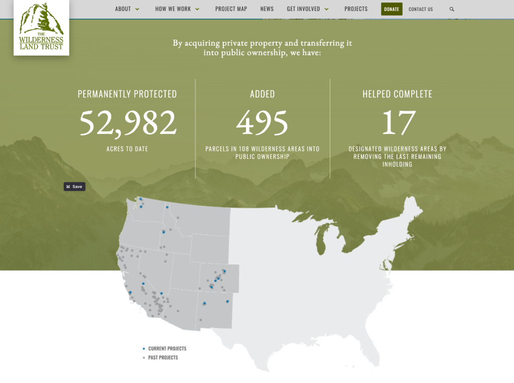
The Wilderness Land Trust is yet another example of a nonprofit website design with a totally different feel—and again, it works! Really, really well. There’s a lot to love about this website design, but here are a few highlights in particular:
- A great example of a more complex color palette (made of five colors: gray, green, maroon, yellow, and teal)
- Strategic use of stunning photography
- Classic serif typeface (EB Garamond) adds an air of vintage/traditional/classic/formal
- Two secondary fonts in sans serif provide a nice visual balance and keep the site easy to read
- Great use of dividing lines and background shapes to visually break up the page
What makes this one of the best nonprofit website design examples?
All of the design choices on this website work together to create a feeling of traditionalism and heritage. The color palette draws heavily from earth tones but avoids feeling too masculine or too dark by brightening it up with a brighter blue as well as very vibrant photographs.
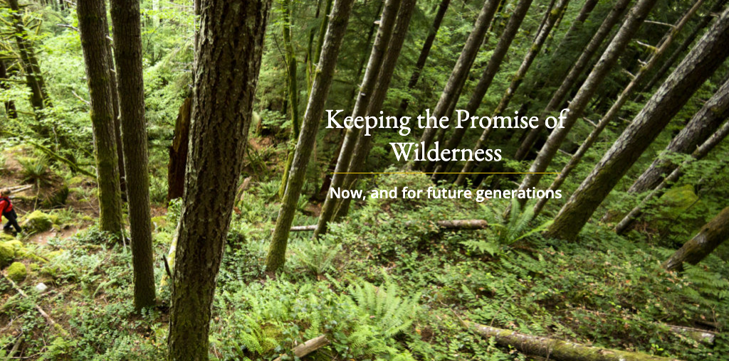
My only suggestion would be to find a different text treatment, as many of the photos make it difficult to read the text (especially for people with low vision). You can see this in the example below.
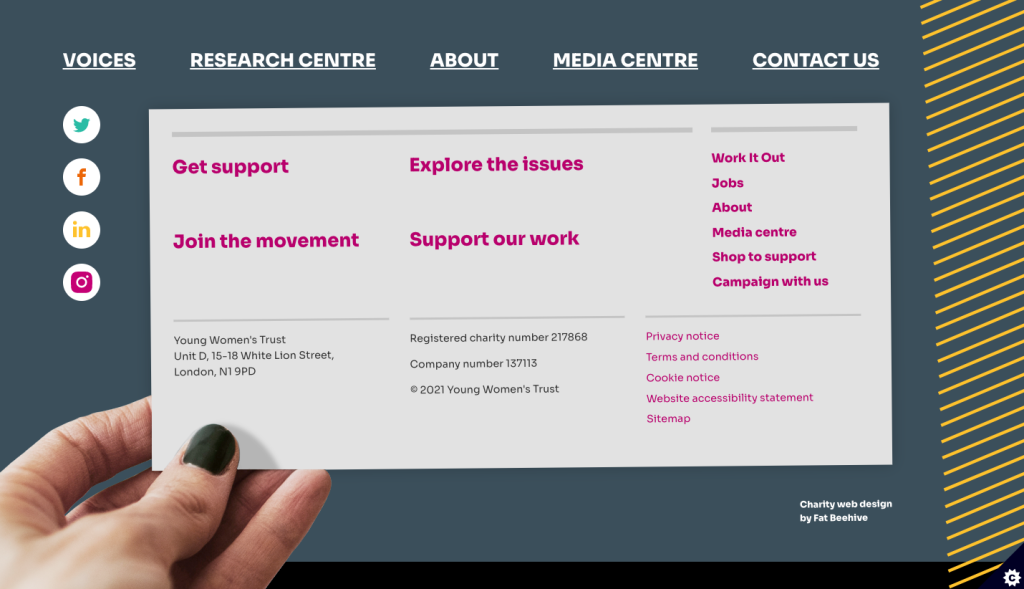
Young Women’s Trust
Overall brand impression: active, daring, fearless, quirky
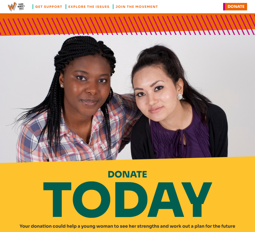
Young Women’s Trust is certainly not hiding behind a boring, run-of-the-mill website. From the size of the headline text to the color palette, this website is 100% in your face—in a good way!
This is an example of a very strong and clearly articulated brand identity, so you probably either like it or you don’t. And that’s okay! This kind of clear branding can help the organization resonate with those who like it and skip over those who don’t.
Whether this particular style is your jam or not, there are some objectively great design patterns here:
- The repeated design motif of diagonal lines (actually pulled from the lettering of their logo!)
- Energetic non-horizontal lines for buttons and background elements (similar to Harlem Children’s Zone above)
- Extremely vibrant color palette
- Fun dual-colored buttons (that animate upon hover)
- Oversized headline text—not always recommended, but it works well in this brand context
Another fun touch is the footer (shown below)! I’ve never seen something exactly like this before, and it feels like something that could easily look a bit off or over the top…but for some reason, I love it here.
What makes this one of the best nonprofit website design examples?
From the upward arrow in the logo to the off-kilter geometric lines, everything about this website design expresses boldness and movement. And that’s exactly what the organization wants you to feel—even asking you to “Join the movement” right in their navigation bar (shown below).

If I were to pick one thing to change, I’d give the website a maximum width. It currently expands to the entire screen width of my large monitor, and the headline text is already so large that when expanded becomes very difficult to read.
Nourish California
Overall brand impression: professional, trustworthy, friendly, calming
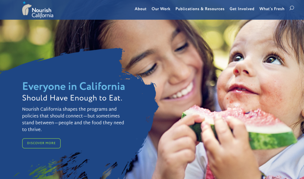
Nourish California is a fairly rare example of a nonprofit website with a single-color palette. (Technically, green and yellow seem to be accent colors, but the overwhelming color vibe is blue—enough that I’d consider this a monochrome palette.)
Blue is one of the most popular colors for website design because it’s fairly personality-neutral. Most people like it, and it doesn’t make a particularly strong statement in any way. Nourish California is a great example of how blue can work well—feeling lively but calming, professional but not stodgy.
Some great design aspects of this site include:
- Great use of repeated design motif of watercolor brush stroke (see the home page hero image above)
- Simple but well-implemented color palette
- Unique font that feels familiar but is not one of the most overused fonts
- Organic shapes and lines rather than boxy background elements (which nicely and subtly mirrors the curve in bear of the logo)
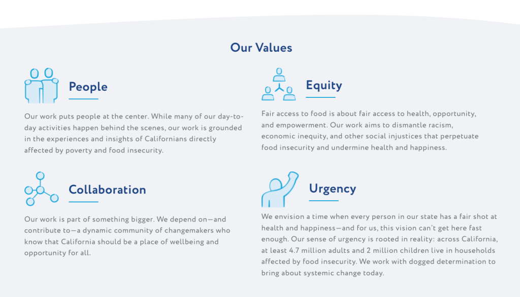
- Hand-drawn icons in place of the typical monoline icons—giving a friendly feel (shown below)
What makes this one of the best nonprofit website design examples?
This website is extremely polished and well designed. It has a clear design motif—using illustrations inspired by hand drawing and painting—and a very well-implemented single-tone color palette.
Overall, the Nourish California website shows that you don’t have to be over the top with any single design element. You can keep everything understated and simple—even just one color!—and still create something that stands out for its professionalism.
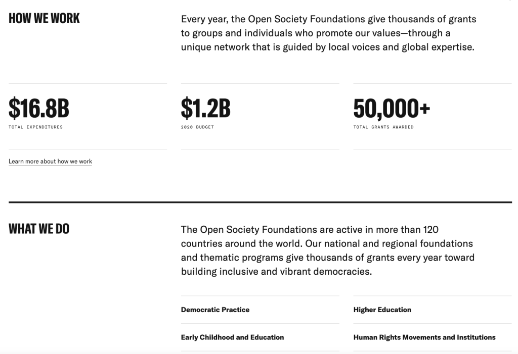
Open Society Foundations
Overall brand impression: formal, stark, serious, techie
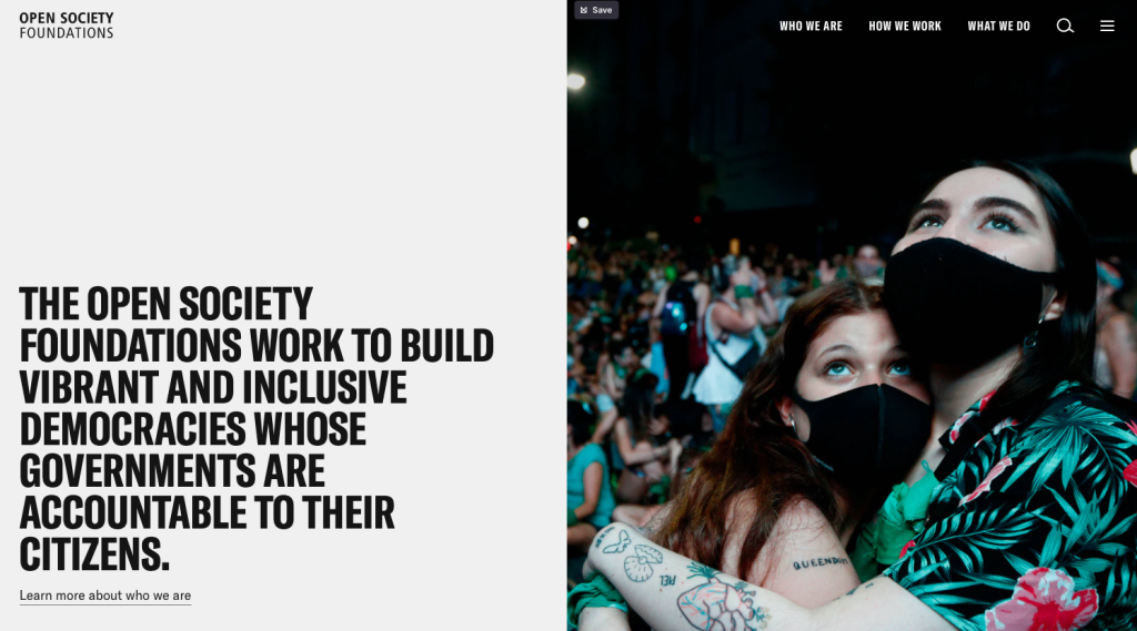
Open Society Foundations has a unique vibe to their website, utilizing a pure black and white color scheme with a bright green accent color. The result is a website that somehow feels both dramatic and understated, both formal and a little bit techie (thanks to the highlighter green). The techie bit lines up well with their clear focus on data-driven approaches and results.
Here are a few other things that make this design work well:
- TONS of white space between elements, creating a clear delineation of various sections
- Strong headline font with some personality but too not much
- Simple design motif of circles (used on maps, timelines, and data visualizations)
- Good use of shades and variations of gray
- Large, easy-to-read paragraph text
- Great use of a layout grid, keeping things aligned and establishing a sense of visual hierarchy (see the screenshot below)
What makes this one of the best nonprofit website design examples?
Like Nourish California, the Open Society Foundations website shows that you don’t need very flashy design elements to create a polished, cohesive, and professional-looking design. The understated color palette works to draw attention to the most important elements while maintaining a formal and authoritative feel.
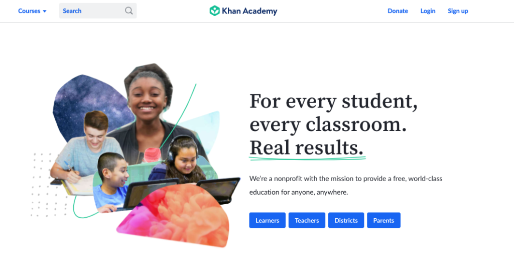
Khan Academy
Overall brand impression: curious, youthful, creative, approachable
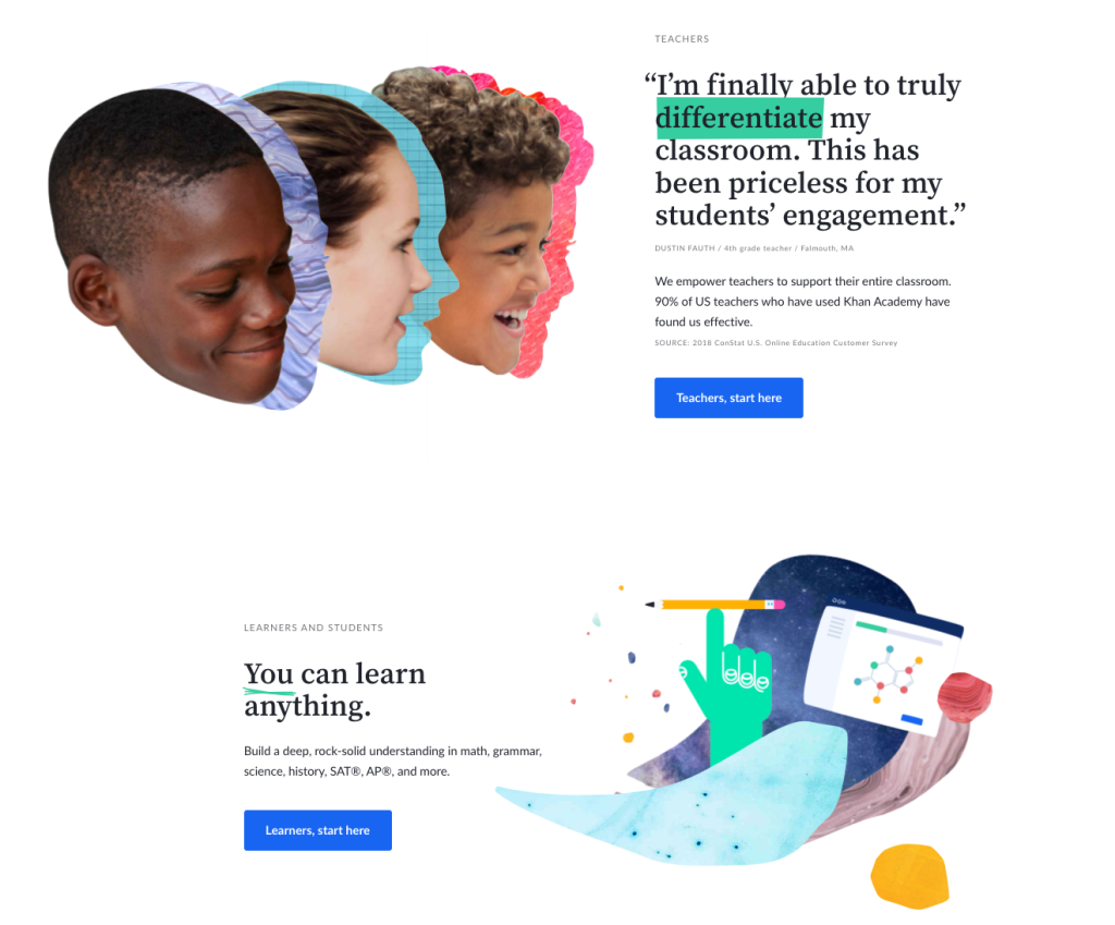
Khan Academy is the perfect example of how a design can be well done but still not to your personal liking. At least, not to mine! To be honest, I do not love the design motif they’ve chosen: very asymmetrical shapes made to look like a child’s collage. It’s just not my cup of tea.
However, I can certainly appreciate that the design is well thought out and well executed. Here are some highlights of this nonprofit website design:
- Very clear and consistent design motif of cut-out shapes layered on top of one another
- Hand-drawn details, like underlines and arrows
- Excellent use of white space
- Fun animations to highlight text upon hovering
- Love the friendly but classic serif font for headlines, especially as serifs are much less common and have an academic feel—perfect for a learning organization!
Like the First Nations Development Institute, Khan Academy makes good use of buttons at the top of the home page to direct website visitors to the most relevant and helpful information, based on who they are and what they might want to know.
What makes this one of the best nonprofit website design examples?
While not to my personal aesthetic, the Khan Academy website does a terrific job of creating a cohesive design scheme.
It manages to use similar motifs as other websites on this list (asymmetrical shapes and hand-drawn details) but still stands apart for its unique use of them. The color palette is bright and youthful but feels professional and perhaps more “grown up” compared to many other youth-focused educational websites.
19 More Examples of Great Nonprofit Web Design
If you want to explore even more nonprofit websites, I recommend checking out the ones listed below!
Like the examples discussed above, these organizations make great use of font, color, design motifs, and white space to create a polished and professional-looking website. They’re fantastic examples of VERY different brand identities, too, ranging from vibrant and artsy to understated and formal.
- Hayward Burns Institute
- Austin Parks Foundation (also has a great nonprofit email newsletter!)
- NAACP
- Girl Effect
- Seventh Generation Fund for Indigenous Peoples
- Studio Museum Harlem
- Bridges4Life
- FoodCorps
- 1in6
- Women Against Abuse
- Peace Over Violence
- Nashville Public Education Foundation
- National Black Leadership Commission on Health
- Cooper Hewitt
- The Night Ministry
- Black AIDS Institute
- Trans Lifeline
- Ocean Conservancy
- Generation Citizen
Checklist: 7 Must-Haves for the Best Nonprofit Website Design
Here’s a good rule of thumb, and one that can take some getting used to: evaluating a nonprofit website design is not about asking the question, “Do you like this?”
There’s too many yous, and “like” is far too subjective!
Instead, evaluating your web design should come down to answering the question, “Objectively, does this design work?” And in terms of visual appeal, that comes down to specific things you can literally point to on each and every page—just like we’ve done with all the nonprofit website examples above.
So, to summarize…
Below is a quick checklist you can use to look for the best nonprofit website design elements, as discussed above. Pull up your website and ask yourself, does it have:
- A modern layout? One of the most obvious tells of an outdated website is one that’s boxed into a narrow column, which usually screams 2000 – 2005. Changing this single aspect will make a HUGE difference in terms of how up-to-date your website feels.
- A thoughtful color palette? Good rule of thumb: choose colors directly from your logo (or lighter variations if they are too dark). If you are not a designer, stick to just one or two colors max and use an online color palette generator to assist. Headlines and link text can be colored, but most paragraph text should remain black (or whatever dark color you are using for paragraph text). Too much colored text tends to look amateurish.
- Well-paired fonts? If you are not a designer, try to use online font pairing tools to help you choose fonts that work well together. Unless you have design experience, it’s best to use only one or two fonts on your website.
- Clear organization? By good organization, I mean well-divided sections with enough breathing room between them. In general, include more white space than you first think necessary. You can test the layout and organization of a page by asking someone to scan it very quickly and tell you where the sections break.
- Intentional alignment? As much as possible, try to keep elements of different sections lined up. One of the most distracting and common mistakes here is to use too much center alignment, especially for paragraph text. Any small or large text longer than a couple of lines should not be centered, as it becomes too difficult to read.
- Repeated design motifs? TONS of motifs were highlighted above, including lines, circles, geometric shapes, paint brush strokes, textures, and photo overlays. Well-done motifs are usually used as accent elements—in the background, to highlight links, to add visual interest on top of photos, or to visually break up sections.
- Additional flourishes? These “nice to have” elements are usually more costly or challenging to implement and include things like animations, hover effects, large “mega” menus, animated loading screens, and mapping applications. If you have the capacity, these fancier flourishes can add a delightful touch.
All of these elements go into creating a polished nonprofit website design—one that looks professional, attractive, and well made.
At the same time, though, it’s important to remember that visual design is not the end-all-be-all of your nonprofit website. Instead of just asking “Does this design work?” the ideal question should be this: “Does this design work to achieve your nonprofit’s specific goals?”
That’s the key.
Effective graphic design for nonprofit organizations will always take your audience, mission, and goals into account—ensuring that the website (or poster or flyer or annual report) is not just a pretty picture but rather an strategic tool to serve your mission and grow your impact.

Check out some tips for planning your nonprofit website redesign.
Want some DIY, do-it-right-now nonprofit website improvement instead?
Download our free guide to the 54 most common nonprofit website mistakes. Inside, we cover why each problem matters and how you can fix things yourself.