It’s no big secret that logos are important to a nonprofit organization. More than just a means of identifying your org, your nonprofit logo is a wonderful opportunity to reinforce your brand message, your personality, and your tone.
For example… Are you:
- Upbeat and hopeful?
- Serious and academic?
- Youthful or established?
- Quirky and clever or straightforward and straitlaced?
- Traditional or out of the box?
- Techie and data-driven?
When a nonprofit logo is designed well, all of these unique vibes can be captured in it—helping donors, beneficiaries, funders, community members, and other key stakeholders easily understand who you are and, more importantly, WHY you are.
Our Picks for the Best Nonprofit Logo Design
To see exactly how a nonprofit logo design can accomplish all this, check out the top examples below!
In addition to showing the logo and linking to each nonprofit’s website (so you check out their amazing work for yourself!), we also point out why these impact organization logos are so effective and well designed. By the end of the article, you’ll be able to take the same ideas and run with them for your own nonprofit brand.
Stick around to the end of the list to get some extra pro tips on how to draw from the elements of your logo design to create a better nonprofit website design.
Download the complete nonprofit homepage template
Wondering how to make your nonprofit’s homepage as clear, captivating, and user-friendly as possible? Download our homepage template and interactive PDF with a list of 11 essentials for a nonprofit homepage.
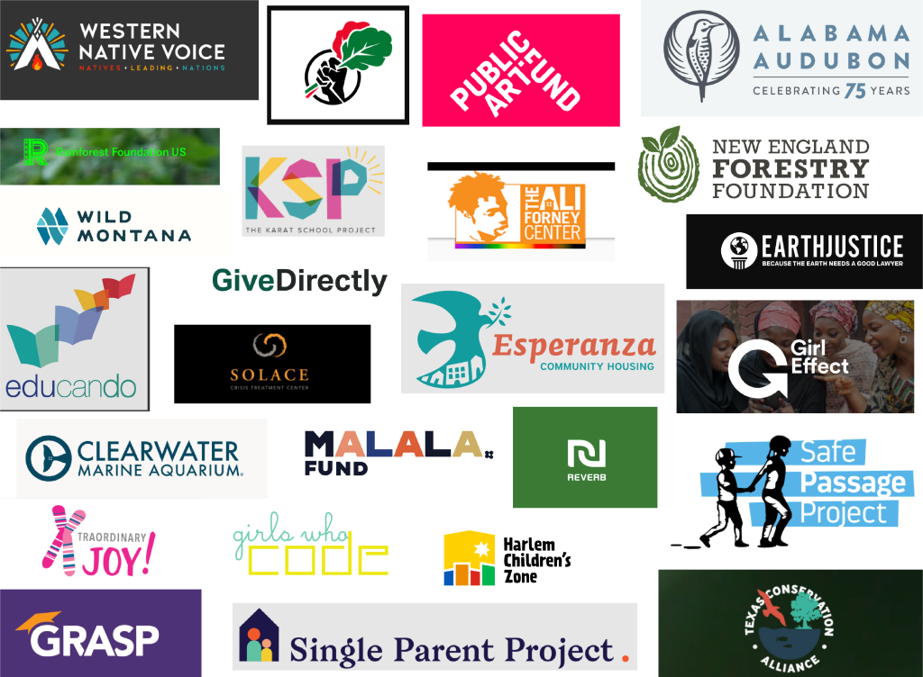
Western Native Voice
Western Native Voice is a fantastic example of a modern, clean, and visually interesting nonprofit logo design.
It utilizes a well-balanced three-color palette and a recognizable symbol that connects to the heritage and purpose of the organization. The strong angular lines of the badge (the teepee and sun rays) are mirrored in the diamonds separating the words of the tagline: Natives Leading Nations.
The font feels like a natural choice, too, as its geometric letterforms reflect the shapes and angles of the badge to the left. The letters feel modern, friendly, and open.
Black Food Justice
Black Food Justice is an example of a powerful nonprofit logo that instantly embodies the spirit of the organization—without even needing to have the name spelled out! This logo makes clever use of an immediately recognizable symbol of empowerment, revolution, and solidarity by placing two vegetable leaves in the hand of a raised fist.
The nonprofit organization’s logo draws from the red, black, and green color palette of the Pan-African flag, tying their work into the long fight for Black freedom.
Girls Who Code
I love the Girls Who Code logo for lots of reasons, but the biggest one is probably the fact that it’s so well balanced. The layout works very well, with phrase “girls who” sitting nicely atop “code.” The balance extends to the typefaces, too—with the very boxy and exaggeratedly square “code” being paired with a very loopy, youthful cursive for “girls who.”
The end result is a logo that feels young and lightly feminine without falling into the trap of overused gender stereotypes (which not only looks less professional but can feel less inclusive).
Rainforest Foundation
The Rainforest Foundation‘s nonprofit logo goes bold by using a neon green that most organizations probably wouldn’t touch. I love how this logo design draws from the general color scheme of earth, life, and plants—without being too expected in terms of “earth tones.” The bright green makes the organization feel more urgent, youthful, and active.
The geometric patterns within the logomark (the capital R) also work well by reflecting geometric patterns from indigenous cultures who call the rainforest their home.
Alabama Audubon
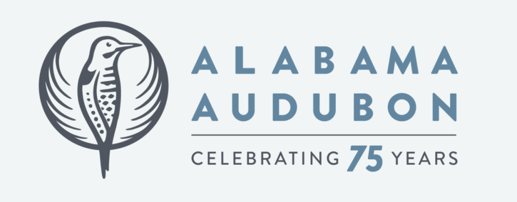
Alabama Audubon is another great nonprofit logo design example. Using a simple blue and gray color scheme, this logo feels elegant and modern while still representing heritage. The bird’s illustration style evokes a lightly vintage feel thanks its to round badge shape and its woodcut/linocut aesthetic.
As a bonus, this logo design is quite versatile! It leaves room beneath the organization’s name for special taglines, such as the one pictured here: “Celebrating 75 years.” By considering these types of special occasions within your nonprofit logo, you’ll make sure it’s future-proof and easy to adapt.
Single Parent Project
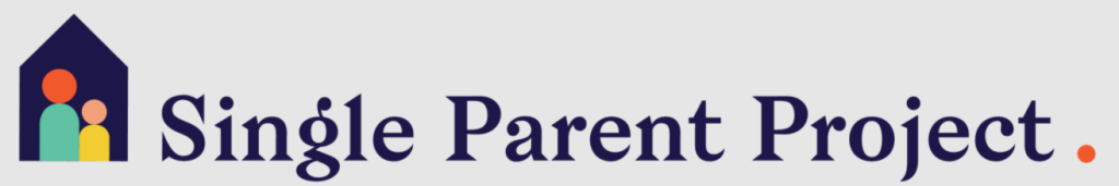
The Single Parent Project stands out among nonprofit logo designs for two main reasons:
- It utilizes a less common color palette. (Purple tends to be one of the least used colors!)
- It has a unique typeface. In a world where every logo is becoming a plain, fairly personality-less sans serif, this logo uses an interesting serif font with quirky flourishes and curves.
GRASP
Another organization with purple in their nonprofit brand identity is GRASP. I love the simplicity of this logo, especially because it still manages to communicate what the organization does! The tilted graduation cap feels friendly, a vibe that’s mirrored in the open, rounded sans serif typeface.
The slight overlapping of the letters is nice, too, as it adds some character to the logo. Because the “A” is set forward (with the “R” and “S” behind it), the logo has a subtle feeling of balance as well.
Malala Fund
Malala Fund takes advantage of a unique typeface for its nonprofit logo design. While it is a sans serif that feels similar to many fonts that are popular now, the design includes a few quirks to keep things fresh. In particular, the bottom line of the “L” is extended much more than normal, and the letters are a bit squat overall. This adds a feeling of groundedness yet playfulness.
The alternating colors and small flower detail further round out this balanced and professional design.![]()
The Ali Forney Center
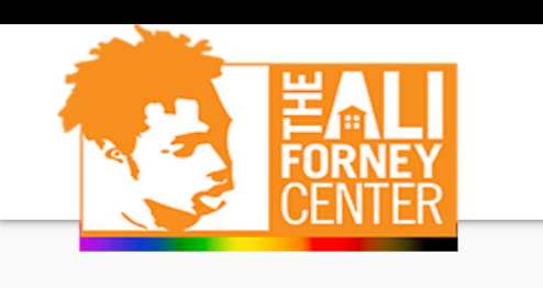
The Ali Forney Center has a much more complex logo design. The image of Ali Forney—whose tragic murder inspired this organization’s founding—is given prominence to the left. The illustration style feels like a stamp or an Andy Warhol image and is striking. The letters on the right are interestingly combined by still easy to read.
If I were designing this logo, I’d probably leave out the house or the rainbow gradient at the bottom, as it does end up looking a bit busy. I might also reduce the font weight of “THE” since this is not as important of a word. Overall, though, I find this logo striking.
GiveDirectly
GiveDirectly takes simplicity to the extreme with their nonprofit logo design. Using a very basic sans serif that is similar to the classic Swiss font Helvetica, this logo feels straightforward, no-nonsense, and functional (but still well designed).
The green and black color scheme of course reflects the colors of the US dollar—reinforcing this organization’s mission of direct cash transfers to people living in poverty.
Esperanza Community Housing
I love the nonprofit logo design of Esperanza Community Housing. The two colors are great complements to one another, and the primary font (for “Esperanza”) feels quirky and interesting without looking too youthful or unprofessional.
The dove carries great symbolic meaning to reinforce the organization’s mission, and the houses inside have a playful, asymmetrical, hand-drawn feel reminiscent of vibrant folk art.
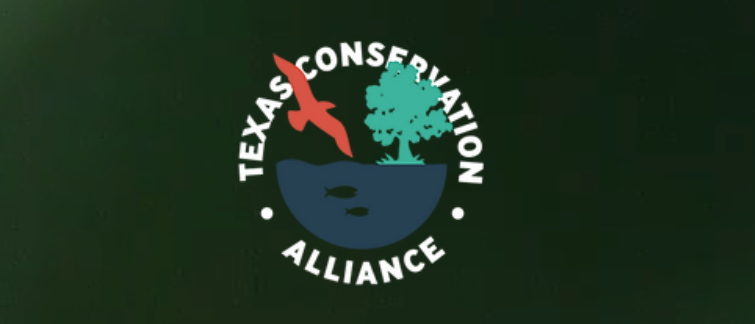
Texas Conservation Alliance
Texas Conservation Alliance takes advantage of a classic logo style—a round badge with text encircling—but puts a modern feel to it. The color scheme is well balanced and contemporary, while the font evokes vintage posters (like those used to advertise national parks back in the day).
Another modern touch is the playful overlapping of elements, where the tree and the eagle are placed in front of the text.
Download the complete nonprofit homepage template
Wondering how to make your nonprofit’s homepage as clear, captivating, and user-friendly as possible? Download our homepage template and interactive PDF with a list of 11 essentials for a nonprofit homepage.
Safe Passage Project
The Safe Passage Project does a great job of embodying its mission within its nonprofit logo. The stylized illustrations of the children are very unique and do a good job of being easy to understand without getting too visually complex. Along with the walking of the children, the horizontal stripes add a feeling of motion and movement.
By cutting the lines at angles (rather than making them straight boxes), the logo also creates a sense of youthfulness and activity.
Xtraordinary Joy
Xtraordinary Joy is another nonprofit logo with a lot to love! Although I’m personally not a fan of hot pink, I can appreciate how this vibrant and traditionally gendered color contributes to the overall brand identity of this organization. The two fonts feel very well balanced, and the placement of the exclamation mark ties the two lines together well.
The use of the X chromosome for the X further reinforces the org’s mission, and while it’s not the most unique idea in the world, it is definitely well executed! The slight tilt matches the tilt of the exclamation mark for a sense of balance, too.
Clearwater Marine Aquarium
Clearwater Marine Aquarium is a great example of white space used cleverly in a logo. If you look one way, you’ll see the tale of a whale; if you look another, you’ll see the shape of a “C”! Balanced by a geometric all caps font, this nonprofit logo feels very professional overall.
Public Art Fund
No surprise for an organization that specializes in contemporary art, Public Art Fund has a very striking and cleverly executed logo design. The more you look, the better it gets!
The overall shape of this logo recalls an upward arrow, which of course invokes the concepts of motion, growth, and forward progress. The top of the “T” in “ART” is also cut through the middle, forming the dot of an upside “I” in the word “PUBLIC.” This flipping of letters is an interesting allusion to different perspectives and delightful surprises—both of which are major benefits of public urban art.
Educando
Educando has a nicely designed logo that embodies a spirit of growth and clearly communicates the nonprofit’s focus on education. Using books illustrated to look like butterflies, this logo evokes the idea of transformation through education—and the sense of lightness and flight also inspires a feeling of hope!
Harlem Children’s Zone
Harlem Children’s Zone has received praise from us before for their awesome nonprofit website design. Given how closely the overall brand is reflected in that design, it makes sense that the logo itself is terrific, too!
I love the bright colors, the strong geometric shape, and the simple but recognizable illustration of a skyline. (The bright colors definitely make you think of those wooden building blocks that kids play with, right?) The typeface is a great choice, too, since it’s quirky and has slightly tilted letters that evoke movement, music, and youth.
New England Forestry Foundation
One noteworthy thing about the New England Forestry Foundation logo is its use of a slab serif font. This type of font is far less common than sans serif fonts or serif fonts, which can help set a nonprofit logo design apart visually. (I’m actually personally not a big fan of slab serifs, but they can definitely work well in some cases!)
I also love the color scheme of this logo, using a nice olive green and a very dark brown-gray for the text. The texture and uneven edges of the wood make it feel almost hand-stamped, which adds a sense of heritage and authenticity to the logo design.
Wild Montana
I’ve written about Wild Montana before, as they’ve put out some great nonprofit annual report designs. I guess it should be no surprise that this organization also has an awesome logo!
Things to love about it include: the way the “W” and the “M” initials are reversed and reflected in the logo, the way the logomark recalls mountains and lakes without being too literal, and the vintage-looking sans serif font. The words are also letterspaced nicely (referring to extra space between each letter), which tends to add a more elegant and high-end feel to a design.
Solace
Solace Crisis Treatment Center utilizes a much more abstract logo than some of the other nonprofits on this list. However, it certainly works to express the idea of being connected and held. The two circles could represent hands that are being held or people who are embracing.
One notable thing about this nonprofit logo design is the color palette. Orange itself is quite uncommon in logos, especially for organizations in this space. Combined with the large sans serif font and the gray and black accent colors, the end result is a feeling of gravity and formality.
Earthjustice
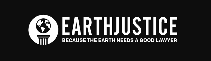
The Earthjustice logo uses a basic black and white color palette with a thin all-caps sans serif font and a simple badge to the left of the wordmark. This logo feels modern, clean, and simple yet retains a sense of classicism and formality thanks to the stark color scheme and the use of the Roman column.
For its 50 year anniversary, this organization has done something extra clever with their nonprofit logo—making the circular badge into a 0!
The Karat School Project
The Karat School Project has a vibrant, youthful logo that makes great use of three bright and well-balanced colors. The uneven edges remind you of a child’s craft project, while the overlapping shapes recall a kaleidoscope or kids’ science experiment with light and color.
This nonprofit logo also makes clever use of white space by hiding a diamond in the hole of the “P.” The lines extending outward help evoke the idea of a bright future, too.
The Girl Effect
We couldn’y have a list of the best nonprofit logo designs without naming Girl Effect. This organization’s logo is powerful and simple, creating a capital “G” from an arrow to embody the organization’s purpose and mission.
The typeface is also a nice choice, as it contains small touches of personality (like the ligature connecting the two “F” letterforms and the light curve of the “T”) without having so much character that it detracts from the star of the show.
Reverb
The Reverb logo is a great example of how a fairly simple design can encapsulate many different ideas—all of which come together to reinforce the message and mission of the brand. This nonprofit logo combines:
- Shapes that recall leaves (as a green music movement organization)
- Shapes that reflect the R and V of the organization’s name
- A color scheme that clearly ties into the green mission
Download the complete nonprofit homepage template
Wondering how to make your nonprofit’s homepage as clear, captivating, and user-friendly as possible? Download our homepage template and interactive PDF with a list of 11 essentials for a nonprofit homepage.
Your Nonprofit Logo Is Just the Starting Point!
While a nonprofit organization’s logo is certainly important, it’s only one piece of the overall puzzle. Just as important as the logo itself is how you draw from the design elements to create a cohesive, professional-looking website design.
If you aren’t sure what I mean, here’s a good example. See how Girls Who Code take their logo—the square font, the loopy circles, and the color—and apply to the rest of their site? They use curvy lines and geometric shapes as accents for underlining, icons, and more.
From all of the nonprofit logo designs mentioned above, these websites do the best job of using the logo throughout—so take a look to get inspiration!
- Wild Montana
- Girl Effect
- Clearwater Marine Aquarium
- Safe Passage Project
- Girls Who Code
- Texas Conservation Alliance
- GiveDirectly
- Harlem Children’s Zone
The bottom line is this.
A nonprofit’s logo can only go so far by itself—but an entire design system that uses the logo’s font, color scheme, and visual details? That is something that will clearly resonate with people and that will form a brand identity that supporters will remember.