Most nonprofits that we speak with are 1) looking to improve their websites and 2) aware that something isn’t quite right.
They know that something is missing from their online presence…but they aren’t exactly sure what that “something” is.
- Some web designer-y people might say that the missing piece is a big-and-bold layout for the homepage—something that no one else is doing; something that POPS!
- Others might say it’s a snappy mission statement with just the right number of buzzwords in just the right order.
- Other more techie people might say it’s XYZ plugin or XYZ software that’s a “total gamechanger.” (Whatever that means, right?)
There are lots of listicles out there on the internet naming the must-haves for your nonprofit website… and many of them are actually pretty useful! But the fact is that the answer to “What’s missing from my nonprofit site?” tends to be both simpler and more complicated than what can be covered in a few hundred words.
In our experience, what’s most often missing from nonprofit websites is just one thing: strategy.
Picture a Castle
To understand what we mean, picture a castle.
Your nonprofit website is like a little digital castle that you’ve built up year after year. (Or maybe decade after decade if you’ve been operating long enough.) Every time a new team member comes on board, every time management decides to move in a new direction, every time a program is re-evaluated and re-defined, every time a new grant comes through… What do you do?
You add a brick to the castle.
Maybe the brick is a blog post, maybe it’s a redesigned home page, maybe it’s a new drop-down menu item in your website nav bar, maybe it’s a pop-up form or a call to action to join your nonprofit’s email newsletter.
If you’re lucky, there’s a perfect little nook for whatever brick you happen to be laying next. But nonprofit websites get messy over time and more often than not, you’re piling bricks on top of each other, next to each other, behind each other—ending up with something dark, clunky, and difficult to navigate. Something that, if you’re honest, maybe resembles more of the castle dungeon than the castle.
There’s solid stuff in there, but it’s hard to find with all the bricks in the way.
Your nonprofit website is probably lacking in strategy if you can say yes to these statements:
- Funders don’t understand what we do or why we do it.
- We never know where to put reports, pictures, or program information.
- Our website all over the place, and we don’t know where to start.
- The last staff member left, and I have no clue how to start managing the mess.
- Even our own staff don’t know where to find key pieces of information.
- Very few people use our online donation options.
- The impact that we’re making on our community is not clear.
If this sounds familiar, you’re in great company. Lots of successful nonprofits have less-than-ideal websites and get by just fine…until they don’t. At a certain point, you’ll have to address the castle dungeon if you want to grow your nonprofit’s impact.
How to Look at Your Nonprofit Website Strategy

Taking care of a clunky, confusing, and ineffective website should start where it matters most: strategy. Lots of nonprofit web designers or developers can create a pretty picture for your nonprofit and put it online, but you don’t need a pretty picture. You need a website that works to convey your impact, establish trust with donors and funders, and raise funds for your critical work.
Rushing through the strategy part to get to the nice-looking website part is setting yourself up to fail.
Here’s our take on it.
We know that “strategy” is a huge word that encompasses all kinds of things and means different things to different people. So below we’ll look at some specific ways you can examine your nonprofit website to find out where the most strategic improvements can be made.
Throughout the post, we’ve thrown in some findings from the Nielsen Norman Group. This organization was founded by the two pioneers of usability and “human-centered” design, and they have an awesome report detailing the key factors that go into whether or not a nonprofit website is user-friendly. It’s called “Attracting Donors and Volunteers on Non-Profit and Charity Websites” (though unfortunately available only through a paid license).
If you have questions about the full report or what we learned from it, let us know by sending us an email!
Strategy in Messaging & Content

By “content,” we essentially mean the words on your nonprofit website—also known as “copy.” In other words, “content” asks the question: What are you saying, and what words are you using to say it?
When it comes to strategic content, what’s most often missing is your audience.
Many nonprofits make the mistake of talking only about themselves or assuming that all website visitors are familiar with their terminology. On the one hand, some “about us” talk is essential because donors do care about who you are—but that message still needs to encompass the reader and be accessible to an audience who may have never heard of you before. How does the website visitor fit into your nonprofit’s work, mission, and vision?
There are many things that go into the right messaging, but here are a few highlights:
- Clear language with less “fluff.” Simply put, you need to explain what you do and how you do it. Website visitors should not have to guess based on some generic-looking images or confusingly worded taglines. Lofty buzzwords and fluffy phrasing are much less effective than clear, simple language. (If you follow Don Miller’s Story Brand framework, you’ve probably heard about the “Grunt Test.” Could a caveman look at your site and grunt what it is you do?)
- Thoughtful and limited use of insider terms. On most pages of your nonprofit website, it’s best to avoid “insider” terms, even if those terms represent the official name for your programs, services, or beneficiaries. Someone should be able to understand the text without knowing what certain acronyms or jargon words mean. If there’s any room for confusion, add an explanatory description or use a different, more universally accepted word.
- The direct “you.” As much as possible, speak directly and plainly to website visitors by using “you” and “your” and “we” and “our.” By directly involving visitors through language, they’ll be able to see themselves in your organization’s work.
- The right pieces of information. In addition to clear language that speaks to the user, the “meat” of your content has to be there, too. You need solid information that users care about, including information about your mission, how donations are used, who exactly you serve, your endorsements/partnerships (we’ll talk more about these in the section on visual design), which locations you serve, and your annual report and financials.
For more tips, check out the post we wrote for Donorbox on 9 tips for improving your nonprofit website copy.
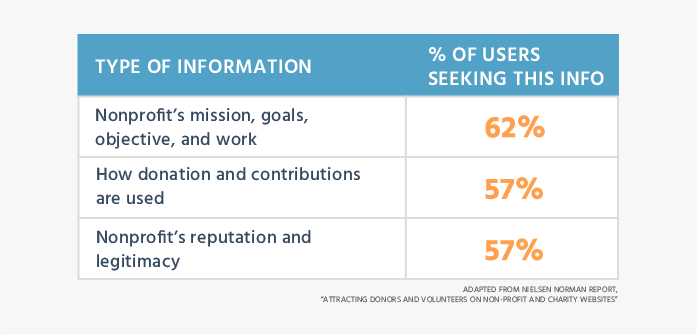
Nielsen Norman Group Report Takeaways
According to the Nielsen Norman Group study, these are the most important pieces of information, or “content,” that a website visitor needs to know before donating.
More key takeaways:
- Only 47% of the 60 nonprofit organizations in the study answered the most important question on the homepage: “What are you (as a nonprofit) trying to achieve?”
- Only 5% answered the second most important question on their homepage: “How will you (as a nonprofit) spend my money?”
- A total of 43% of the “donation-killers” identified by their study were related to poor content and messaging: “unclear or missing information and confusing terms.”
The bottom line: The #1 top priority for a nonprofit website should be “clear-spoken information.” Most donors found the donation process itself to be fairly easy, but they had to understand the content before being willing to make a donation. Err on the side of clarity over buzzwords, jargon, or abstract ideas.
“Speak plainly and answer donors’ main questions, and money will flow your way.”
Example of Clear Messaging on the Homepage
OneGoal explains their mission front and center, right on the homepage. There are no buzzwords about the power of education (although they clearly believe in it)—instead, the goal is 100% clear and plainly stated: college degrees for everyone.
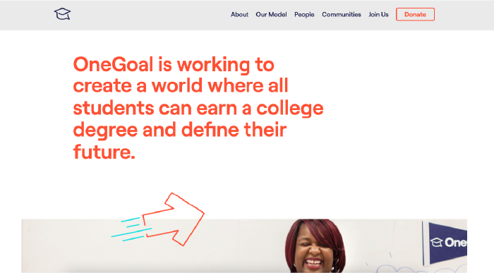
The rest of the home page continues to be thoughtfully written; it’s addressed directly to the audience and captures what website visitors would want to know most, including sections for “What We Do” and “Why It Matters.”
The clear messaging is improved, too, because it’s minimal and well-curated. It shares what the visitor might want to know and avoids overwhelming us with sliders, a million blog posts, an unnecessary social media feed, or lots of tiny images that require context to appreciate.
Example of Unclear Messaging (+ Easy Fixes)
Thompson Island Outward Bound Center is less clear with their messaging on their homepage.
Unless you already know what Outward Bound does, it’s hard to immediately determine what they do or who they serve—which is a shame because this organization has an amazing program, focusing on both real-world skills and character development for underserved students in Boston.
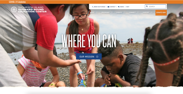
To a totally new visitor, the headline of “Where You Can” poses more questions than answers: Who can? Who can do what?
It’s totally fine to raise questions in your copy—but typically these questions should then be answered as quickly as possible, especially when they relate to key pieces of information on the homepage, like what the nonprofit does, who it serves, and how.
There are tons of awesome design elements on this site and you can tell that it’s been professionally done, but a bit more clarity would go a long way for visitors who are not already familiar with this organization.
An easy fix here would be to write out the mission statement instead of linking to it.
Why make the user click away to find the most basic information? The mission statement could then immediately answer the questions we asked above: Who can do what? The “Our Mission” button could then be replaced with a higher-value call-to-action—like learning more about the programs or making a donation.
Strategy in Site Organization

By “site organization,” we mean how your nonprofit website content is displayed. (This is also commonly called “information architecture.”) In other words, this section asks the question: How are you organizing and presenting your message?
Here we’re referring not to the content itself but to how that content is presented:
- Where is key information located?
- What are the steps required for a user to find the information they’re looking for or to take the action they want to take?
- How simple or complex is the structure of the information?
You can think of content structure or “information architecture” as a cookbook.
Even if it’s been years since you last touched a casserole dish, you know without doubt what to expect from something called a “cookbook.” There will probably be an introduction to the dish, a bulleted list of ingredients and measures, a step-by-step list of instructions, and perhaps some endnotes about common ingredient substitutions or FAQs.
A good cookbook will present this information in a way that we expect, that we can navigate, and that is consistent from start to finish. You won’t have to think about how to use it. But if you start mixing up the order of this information, the cookbook becomes literally unusable. We no longer know how to find anything, even though the information—the “content”—is exactly the same.
This is how the information architecture of your nonprofit website works, too. It’s the “blueprint” of your website, and without a clear and understandable logic, your nonprofit website will not work for your users. They’ll be cooking without the right ingredients.
There are a few common mistakes when it comes to content organization/structure for nonprofit websites, the biggest of which are:
- Trying to squeeze everything on the home page. The information on your homepage should be laser-focused on conveying what you do, how you do it, and why you are credible. Visitors probably don’t need a link to every blog post ever written, a slider with random updates, or a social feed showing random posts written by the intern. Instead, take a “less is more” approach by carefully mapping out which information truly needs to be present and which information can be placed on other pages (and linked out to). If your homepage turns into your junk drawer, most users will not take the time to understand it.
- Cluttered and/or jam-packed nav bar. There’s a common temptation to squeeze every page in existence onto the nav bar, resulting in huge drop-down menus under every nav item. This can be confusing and difficult to use, especially when there are several different pages with similar-sounding titles. (99 out of 100 users won’t click into every page to find out how they differ.) Keep the nav bar as simple as possible, and instead rely on linking within pages—either in text or through buttons.
- Grouping based on internal departments/programs. This is another major issue, especially for nonprofits with many different programs in many different buckets. To group your pages effectively, the key is to keep your website visitor’s perspective in mind. Just because several programs are managed together administratively does not mean that they should be grouped together on your site. Or maybe they can be grouped together but would benefit from some extra explanation for users who may not be familiar with your set-up.
- Lack of clarity in how pages are connected. Part of information architecture is designing how website information is interconnected. A bunch of standalone website pages can be frustrating to navigate—but too many options (where everything is linked to everything else) can be challenging as well. Consider how the user might move through information and focus on making it clear to the user where they are and where they could go next. For example, a button should clearly say where it will take the user; a link should clearly say what it links to; the nav bar should clearly show the user where they are currently located on your site.
- Strange or unexpected site behavior. Clear information architecture makes users feel safe and comfortable on your site because they know exactly where they are and what to expect. Adding unexpected interactions to your site can break that comfort and make users more likely to leave. For example, some common “strange” interactions include a link in the nav bar that navigates to an external website (with no indication that it will do so), a button that goes to a third-party app like a map, a donation link that is run by a third-party provider (with no indication or assurance that this is expected and safe), or videos that auto-play with the volume on.
Here’s a tip if you’re trying to refresh your content structure.
Focus not only on what information the user would want to know but also what action you’d like them to take on that page. Write these two goals down and then work backwards. What needs to be in place for the user 1) to find key information and 2) follow through with the next steps? (“Next steps” could be making a donation, signing up for your email updates, signing up for a volunteer slot, etc.)
Nielsen Norman Group Report Takeaways
- 50% of the “donation-killers” identified by the study were related to “unintuitive information architecture, cluttered pages, and confusing workflow.”
- The two most important pieces of information to donors in their study were “mission, goals, objectives, and work” (62% of users wanted to know this information before donating) and “use of donations and contributions” (57%). This information should be easy to find at all times.
- There’s a fine line between presenting information clearly and being too pushy about the action you want the user to take. The goal from your end should be clarity—and then the user can decide where he or she wants to go.
The bottom line: “Information architecture” can sound a bit stodgy or abstract, but it makes a huge difference to donors. The key is consider how a user (especially a new user) might view your information, not how you or your nonprofit staff view it. Actually testing how users interact with your website is a great way to find out whether your information is clearly presented or not.
“[Users] wanted to know—very quickly—what the nonprofit or charity did and how they did it. When they were bombarded with lots of unrelated information, they became frustrated.”
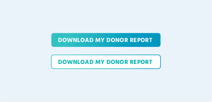
Example of Clear, Well-Curated Nav Bar
Operation Hope does a good job of keeping their nav bar simple and well organized. The About Us drop-down menu does have 7 items, but they are each clearly labeled and distinct from one another. The nav bar is also very focused on what visitors would want to know: who the nonprofit is, the work they do, the areas they serve, and a way to donate.
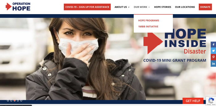
One small improvement we’d suggest is minimizing the number of call-to-actions at the top of the page. Right now, there are three buttons fighting for attention—all with the same color and one with larger text than the others (“Get Help” at the bottom). Ideally we would focus the user on no more than a single action; if we want to suggest multiple, then one should be clearly denoted as the most important.
For example, it’s common to use two button styles as shown below, one that is solid and eye-catching and one that is outlined and more subtle. Both options are there, but one is clearly the showstopper.
Oh, and while we’re at it, we’d also remove the slider. LOTS of people want sliders, but the fact is that they often just don’t work. They hide the most important information, they make users have to search for things (thinking “didn’t I read somewhere…?”), and they tend to distract users with the changing images. Research even suggests that users spend less time on pages with sliders.
Example of Jam-Packed Nav Bar (+ Easy Fixes)
First, let us say that Ferst Readers does a lot of things right on their homepage! They have great photos, they prominently feature the Charity Navigator endorsement, and they clearly state their mission (although the slider feature means that sometimes this fantastic wording is not visible, which we don’t recommend).
But take a look at this nav bar.
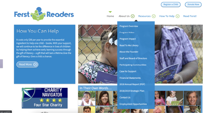
The nav bar presents so many subpages that very few people will take the time to look harder. Maybe they’ll click one or two things, get confused or annoyed, and then give up. Some of the subpages don’t really relate clearly to “About Us”—like “Case for Support,” which seems more like a direct call to funders and donors.
So what are some quick improvements for this nonprofit website?
It would be very easy to combine similar items; we could put all of the program information (3 different pages) and the finances (e.g., financial statements, annual reports, strategic plans) into a single subpage each. That alone would reduce the nav items from 6 to 2, making it far more likely that a website user would even scan all of the subpages in the drop-down menu.
As is the case here, it’s also common for nonprofits to put “home” as an item in their nav bar. This is outdated and only clutters the page. We strongly recommend letting your logo be the navigation to the homepage—users of all ages understand and expect this to be the case.
Strategy in Visual Design

“Visual design” means just what it sounds like. It asks the question: How does your nonprofit website look?
Design might be one of the most misunderstood topics of conversation when it comes to nonprofit website strategy. Because design is immediately apparent to everyone (and everyone has an opinion about whether or not something looks good), it’s easy to become overly focused on how your nonprofit website looks.
The fact is that the design itself matters less than you think.
Most nonprofits really do not need an incredibly fancy design for their site. Most do not need a bespoke website with custom animations and unique hover effects and interesting layouts. Most do not need to win some kind of global design award. In fact, chances are extremely high that you’d be best served by a website that—above all else—meets your users’ expectations.
You can certainly incorporate interesting design motifs, great colors, and good-looking fonts…but you don’t need something amazing. (An exception might be a nonprofit that works in the arts, where “artsiness” is expected and helps establish credibility, personality, or donor trust.)
For the vast majority of nonprofit sites, the most important design elements are really the most basic ones:
- Visual consistency. To maintain recognizable nonprofit branding, your website should have a consistent color scheme, fonts, and styling across all pages. Your blog posts or donation page should not look wildly different than your homepage, for example. (If you’re using any kind of website builder or premade theme, you’ll probably get these right out of the box. To keep the theme looking consistent, avoid changing the preset colors, fonts, or other styling details unless you have some design experience.)
- High-quality images. Your images should be high-resolution enough so that they are not pixelated, they should not be cropped at weird angles, and they should not have stock photo watermarks. Despite what people may say, you can absolutely use stock photos, though! Unlike the world of 20 years ago, there are now amazingly professional (and totally free) options like Unsplash, Pexels, and Pixabay.
- Logos and endorsements. When a website visitor is deciding whether your nonprofit is trustworthy, logos of third-party groups are paramount. List as many legitimate partners and endorsements as possible, and don’t be afraid to repeat them across the site. Also ensure that these images are not pixelated, or else it might look like you’re claiming an endorsement that you don’t actually have.
- Accessible colors and text. Web accessibility is so important to providing equal access for people of all abilities. Many nonprofit websites look beautiful but have text that is too small, colors that are too similar, or interactions that cannot be interpreted by a screen reader. (If you need a good starting point for improvement, you can find some easy preliminary checks for accessibility from W3C Web Accessibility Initiative.)
- Mobile-friendly design. You’ve heard this before…but something that many people miss is the fact that “mobile-friendly” means more than just pages scaling down to fit an iPhone screen. To have a site that is truly mobile-friendly, you should consider how certain interactions occur (or don’t) on different mobile devices. For example, it’s possible to hover over a button in a desktop browser, but this action is simply not possible on a mobile device—which means that hovering should not be the only way for a user to understand that this thing is a button.
To make this last point more clear, take a look at the Trying Together website. Can you spot the button in the image below?
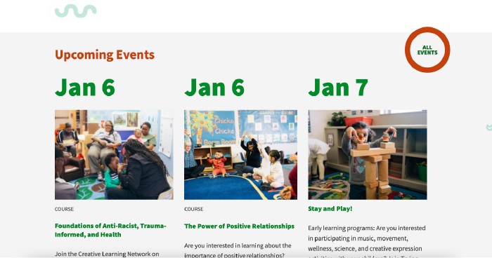
If you aren’t totally sure, neither were we.
On desktop, you can hover over the “All Events” circle and the inside color will change—which helps make it clear that this is a button. The hover effect is very helpful here because this element does not fit the common expectation for a website button.
On mobile, though, there is no “hover” action; you either tap or you don’t tap. That means that on a tablet or phone, we could easily miss that this round circle is supposed to be a button (as opposed to a plain title or a label), which in turn prevents us from viewing events that we might be truly interested in attending.
The Trying Together website looks terrific overall and has a lot of the must-have features for a nonprofit site, but this seemingly small design choice could end up having a big impact on users.
The lesson here is that 99 times out of 100, it’s better to go for clarity over a “neat” design. Stick with design elements that meet users’ expectations: buttons that look like buttons, forms that look like forms, and nav bars that behave like nav bars.
Nielsen Norman Report Takeaways
- One of the most important visual design elements on a nonprofit site is a prominent display of logos, endorsements, accreditations, and awards. Users in the study explicitly looked for these images as a way to determine the nonprofit’s credibility.
- Despite the critical importance of logos and other third-party endorsements, 71% of the 60 websites analyzed did not have these items on the homepage.
- In terms of building trust with users, how the website looked was found to be just as important as what the website said. When asked about site elements that build trust, users commented equally on these three aspects: writing (i.e. “content”), partners and endorsements, and visual design.
- It may seem basic, but it’s important to make sure that your website is easy to read. Text should be large enough, the color contrast should be high enough, and key information should not be hidden in PDFs or other file types that require the user to navigate away from the current page.
“When users visited a website, they made split-second decisions and judgments about the organization based on what they initially saw. Having a professionally designed website immediately built trust among site visitors.”
Example of Great Visual Design for Nonprofits
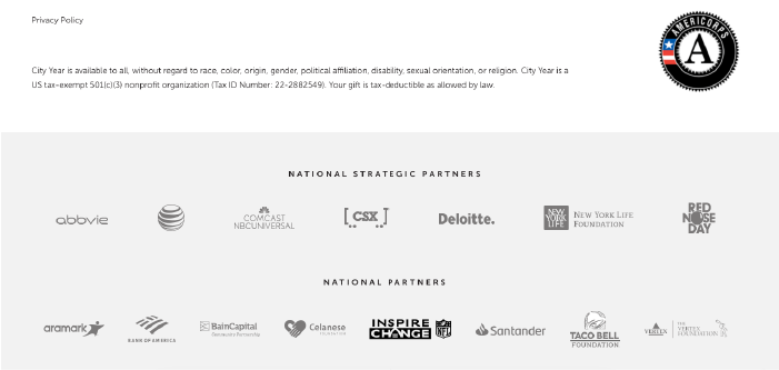
City Year is an example of solid, well-planned nonprofit website design in action.
The City Year website has a definite personality—thanks to design elements like painted brushstrokes, a vibrant color palette, and bold geometric shapes—but it doesn’t take things too far. The text is large and easy to read, the buttons look (mostly) like buttons, and the design is consistent across the site.
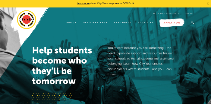
Another important element is that City Year’s many strategic partnerships are displayed visually on the homepage, down toward the footer.
Example of Visual Design That Could Be Improved (+ Easy Fixes)
Silicon Valley Education Foundation (SVEF) is an example of a nonprofit website that could use a bit of polish in terms of visual design.
SVEF clearly does terrific and important work—especially since we first found them through Charity Navigator’s 4-star rating list! However, we’d say that their website design doesn’t always look as professional or polished as the work they do.
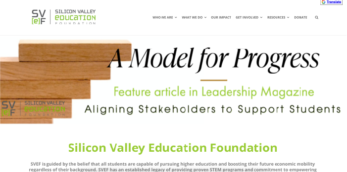
The website does have some great pictures, a clear and consistent color scheme, and a cool logo that definitely reads “techie.” But there are a few easy fixes that could really build on this foundation and make for a more polished-looking and user-friendly design:
- Use fewer fonts. Too many fonts will instantly make a site look less professional. (Note that there are at least four fonts in the image above.) A good tip for non-designers is to use only two fonts: one for the headers and one for the body text.
- Increase the contrast of the text. Some of the smaller text further down the homepage is a very light gray on a white background, making it difficult to read.
- Make the text area narrower. Text that spans almost the entire screen’s width becomes difficult to read, especially for older eyes. Making the wide columns narrower can improve legibility and give the design a bit more “breathing room.”
- Use more buttons. It’s hard to tell from a static screenshot, but there are a ton of elements here that look like pictures but are actually links to other pages of the site. (In fact, the image in the slider above is an example.) When huge elements are clickable, it’s hard to know what is interactive and what is not, and it’s easy to make a mistake and click to a page you didn’t want to go to. Using dedicated links and buttons would help.
Another key design improvement we could make here goes back to those ever-important third-party endorsements. SVEF has amazing donors and partners…but they’re sadly hidden away on a subpage under “Who We Are.”
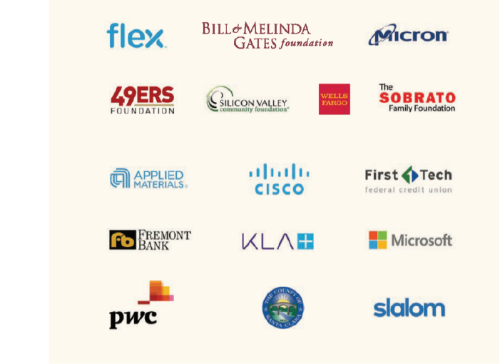
Moving these icons to the homepage would make an immediate difference in how credible the organization appears.
Strategy in Visitor Journey

By “visitor journey,” we mean the steps that a website visitor takes as they interact with your website (and in a greater sense, your organization). Ideally, these are not steps that the visitor takes on their own, but rather steps through which you guide them. This topic asks the question: What are you doing to guide your visitors in their journey and nurture a relationship?
Whether they are funders, volunteers, or beneficiaries, your site visitors are the people consuming your nonprofit website’s content and being served by your organization.
This category strongly overlaps with the previous three, since of course content, structure, and design all go into a smooth and streamlined customer journey. But there are a few distinctive elements we can mention here as well:
- Smooth donation process. Most nonprofits have this one fairly well in the bag, since donation platforms today often run on the same set-up as ecommerce checkout pages. But still, there are a few key recommendations here: keeping the donation process on your own site (vs. on a page through an external payment processor), making it easy for the user to go back, providing information about tax deductions, and displaying logos/guarantees for secure payment processing.
- Email newsletter. Having an email newsletter alone is not enough; you need to pay at least some attention to sending out regular content and keeping your emails relevant and timely. At the very least, you’ll want to customize your “thank you” message and really refine the first few emails you send after a user signs up. Again, it’s critical to consider what the user might want to know. Why did they sign up? How can you meet their needs and encourage them to continue their interest in your organization? What pieces of information would move them toward being more involved with your programs?
- Usable interface. If your nonprofit website has more complex features—like hosting a volunteer portal or offering e-learning courses—then you’ll want to pay particular attention to usability. How easy and intuitive is the site to use? Does your membership platform or course software work well with your current site, or do users get frustrated by having to figure out a strange third-party platform?
- Ecommerce options. Many nonprofits do not sell anything, but it could be worth considering! Branded materials not only give you free organic advertising, but they can also help your organization’s membership feel a sense of belonging and pride—turning one-time donors into a real community. Still Kickin is a great example of a nonprofit with a thriving store that builds community and supports their work. World Vision also has a well-curated ecommerce shop in addition to their traditional sponsorships and donations.
- National vs. local chapters. Along with several of the points above, the Nielsen Norman Group report highlights the importance of matching your local chapter’s website to the national brand. If a website visitor comes to your website from the national organization’s, they expect to experience a consistent look and feel. Any variations can interrupt their journey and make them question your credibility.
Example of a Smooth Visitor Journey
This concept is a little more abstract than content or design, so it’s harder to give a clear screenshot of what we mean. But consider this welcome email newsletter from Eye to Eye.
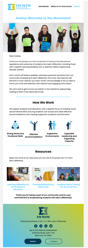
This nonprofit newsletter works to create an extremely smooth customer journey for several reasons:
- It clearly matches the organization’s brand.
- The design is consistent and professional-looking.
- It has a powerful image at the top.
It’s written for me. Many nonprofits will send a simple “thank you” email or a generic form provided by Blackbaud or Mailchimp—or, worst of all, do nothing more than ask for a donation straight away.
Eye to Eye does a great job of realizing that if I just signed up for their newsletter, I likely want more information and that I may not be familiar with what they do (and definitely not familiar enough to make a donation). So they’ve written a great “starter pack” message that reiterates what they do, how to learn more, and how to donate if I want to. Although it’s certainly a long-term goal, getting a donation is not the key message here.
Get more tips on email marketing for nonprofits in our article on the foundations of nonprofit newsletters!
Strategy in Website Admin Experience

By strategy in “website admin experience,” we mean whether and how your nonprofit website can be managed by your staff. This section answers the question: How do you manage your site? How easy or difficult is this to do?
Thus far, we’ve only covered the front-end of your nonprofit website—what visitors actually see and interact with whenever they type your URL into the search bar. But you and we know that there’s a lot more that goes into your nonprofit’s website that just what the users see.
In fact, we often end up speaking with nonprofits specifically because their websites look fine from the frontend…but are actually a disaster from the backend. Maybe the site looked great when it was first made, but now it’s 5 years old and no one can figure out how to update an image, replace the old annual report, or edit the homepage.
Ease of use for staff is one of the most important aspects of any nonprofit website, yet it’s the one most commonly overlooked when undertaking a new website project. It’s kind of a chicken-and-egg problem: the nonprofit team doesn’t really know what to ask to get what they need, and the web developers/designers don’t ask the right questions to find out before building the site.
As a result, you end up getting whatever you get. The website might be easy for your staff to manage, or it might not.
To make sure you’re getting a nonprofit website that works for you, here are some key questions to ask your web developer, designer, or agency:
- How can our staff make updates to these pages?
- Are there pages or parts of pages that we will not be able to update?
- What training will you provide on using the admin tools? Is there a handoff procedure once development is done?
- What documentation or help is available for this platform?
- Can you show me an example of a website that you made for another client? What does the backend look like?
- What happens if we can’t figure something out?
- How does this website work with our greater nonprofit marketing plan?
Being strategic about the website admin side is important because once you’ve created a website on a certain platform or in a certain way, it can be expensive and time-consuming to change. It is 100% worth taking your time to find out how your staff can actually use the website—before you agree to take on your nonprofit website project.
Small Changes Can Make a Difference
Okay, if you’ve stayed with us this long, you’re a champ! Hopefully we’ve given you a few concrete and practical ideas of how to think strategically about improving your nonprofit website.
Before we go, we’d like to emphasize one more thing.
The takeaway here is not that you need to need to burn everything down and start from scratch if your nonprofit website isn’t working. You can do that if you have the budget (and in some cases it might be better and/or easier to start fresh), but if you don’t, that’s okay, too. You just need to be strategic about being strategic.
Focus on the changes that will have the biggest impact right away. Not every nonprofit organization will need to focus on the same things.
For example, if your nonprofit relies on grants for 90% of its funds, then you may be better served by focusing on improving the aspects of your site that matter most to grant evaluators: things like annual reports, IRS forms, statistics of programs and fund allocation, operating expenses, etc. Make these things extremely focused and easy to find.
On the other hand, if you rely on large numbers of small donors who are very active and invested, then you might be better served by figuring out how you can build more of a community—maybe through ecommerce, maybe through strategies for encouraging recurring donations (think the ACLU’s “Guardians of Liberty” program), or maybe through some kind of members-only portion of your site. There are a lot of options to try.
The bottom line?
Choosing where to implement your website changes—and making the changes thoughtfully, on purpose—is the best way to improve your nonprofit’s website and to address that “something” that you know is missing.