Email marketing is one of the most hyped methods of marketing and communication, with tons of articles raving about how great it is—not only for nonprofits but literally everyone. (And it definitely is! We highly recommend it as part of a strategic and effective nonprofit website.)
But rather than read a bunch of listicles about it, we wanted to find out what real nonprofits are really doing with their email newsletters.
What’s working and what’s not?
To find out, we signed up for over 150 nonprofit newsletters and watched the messages roll in over several months. What follows is a summary of what we learned, starting with the most fundamental features of effective email marketing for nonprofits. Some of these may seem basic, but they’re on this list for a reason—because lots of orgs didn’t have them!
So without further intro ado, the absolute “must haves” for your nonprofit email newsletter include:
- Clear sender
- Cohesive brand
- Legible content
- Up-to-date information
- Text-based formatting
If you don’t know where to start or don’t have time to invest in ALL the best practices for nonprofit email marketing, start with these five essentials.
The good news is they are quick and easy to implement and, trust us, will make a huge difference in terms of your nonprofit website and online marketing strategy.
Nonprofit Newsletter Basic Tip #1: Clear Sender
Make sure that whoever appears in the “sender” line is clearly related to your organization.
Whether you use Mailchimp, Convertkit, Blackbaud, or some other nonprofit email marketing software, every reputable platform will allow you to change the “send from” name.
Good Options for the Sender
- Your nonprofit’s full name: Forward for Kids
- Your nonprofit’s acronym (especially if well recognized): ACLU
- Your nonprofit’s name plus info about the mailing list: AHSI Events
- A staff member’s name plus job title: Andrea Schlottman, Director of Development
- A staff member’s name plus nonprofit’s name: Andrea Schlottman, AHSI
- A staff member’s first name only: Andrea, ASHI
It’s okay if the full sender name gets cut off (which is actually quite likely in most email suites like Gmail). It’s more important that the name looks legitimate and has been purposefully chosen by your organization.
In other words, avoid these…
Not-So-Good Options for the Sender
- Whatever the automated name is for your email marketing software
- An internal naming convention that makes no sense to the reader
- Something that reads spammy
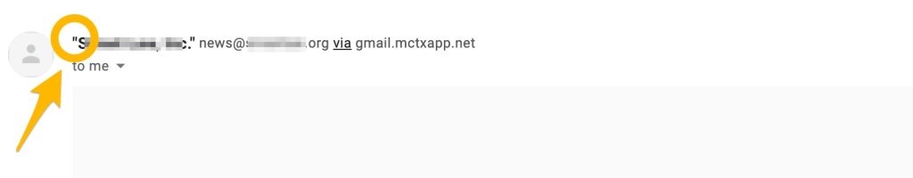
Here are a few real-life examples of what to avoid, like the strange sender name here.

Or the unnecessary quotes here around the nonprofit’s name, which makes the organization look less legitimate. (Or at the very least can be read in a goofy or even sarcastic “in quotes” voice.)
Note that we’ve removed identifying information when pointing out some of our “what not to do” tips, because we’re not trying to be negative about any particular organization. We simply want to show some examples of what we’re talking about, so you can see it in action.
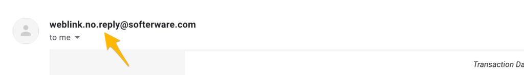
Or the automated name that was just left here (a setting which apparently comes from the nonprofit CRM, SofterWare).
Once you’ve chosen a name for your sender line, test it! Send yourself or other staff members a test email to 100% make sure the correct name appears.
Nonprofit Newsletter Basic Tip #2: Cohesive Brand
Every email you send should look like it belongs to your organization.
In most cases, this will mean incorporating your nonprofit logo, font, color scheme, and other visual design elements. Like the sender name field, these changes should be relatively easy to make within your email marketing platform; if it isn’t, then we recommend choosing another tool.
Ideally, you’ll start reinforcing your nonprofit branding from the very first email you send: the welcome email.
Branded Welcome Email
When someone signs up for your newsletter, you know that they are excited and engaged enough to stop what they’re doing and fill out your sign-up form. Given how busy and distracted we all are, that’s no small accomplishment.
So there’s almost nothing worse than wasting that excitement by sending this drab default email.
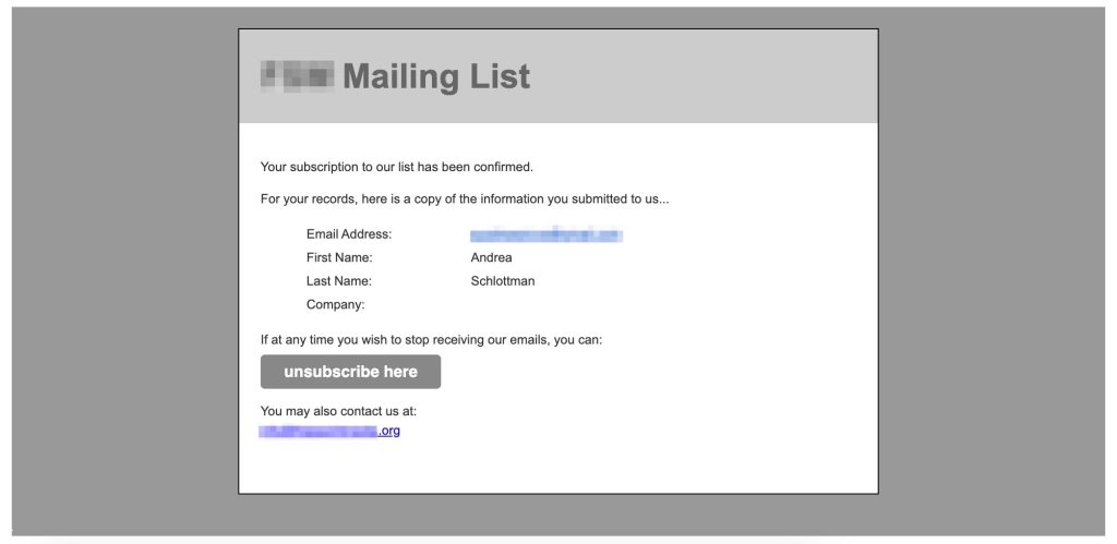
Much to our surprise, we received over a dozen “welcome” emails just like this one. And yes, “welcome” is in quotes because, really, does this look welcoming?
For an example of what to do instead, look at the below email from Donors Choose.
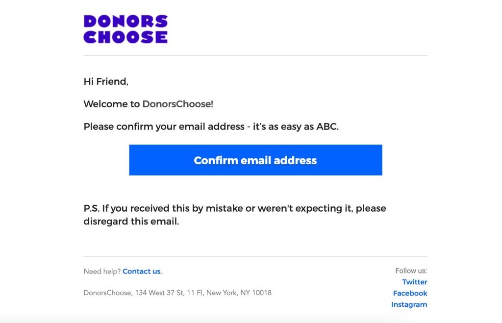
It accomplishes the same basic task as the email above (it’s a simple, short message to confirm your sign up), yet it’s colorful, laid out clearly, and well branded. Even the text is friendly and approachable—”it’s as easy as ABC.”
Other Branded Emails
Technovation does a fantastic job of keeping to their brand in every single email. They use consistent colors, icons, and design elements, and their logo is front and center at the top.
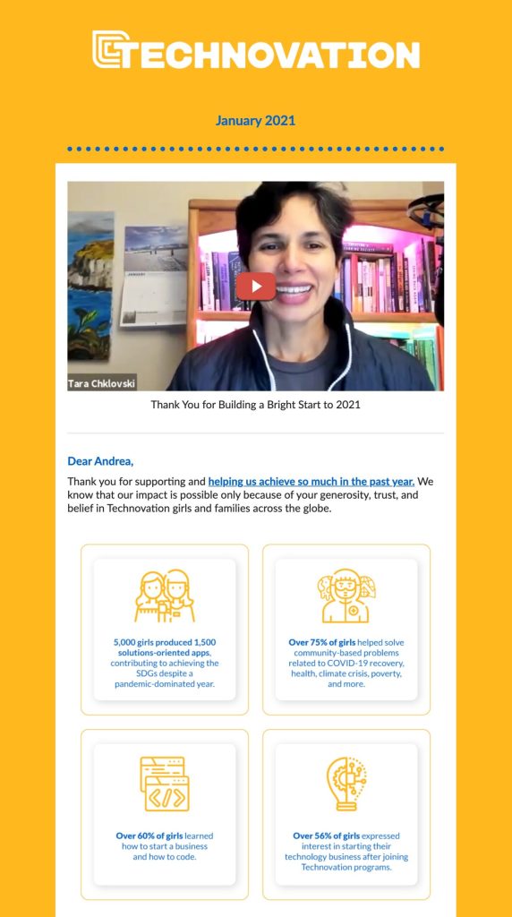
Technovation is a great example of a fully fledged and well-branded email, but you don’t have to be so thorough if you’re short on time or don’t have a graphic designer accessible.
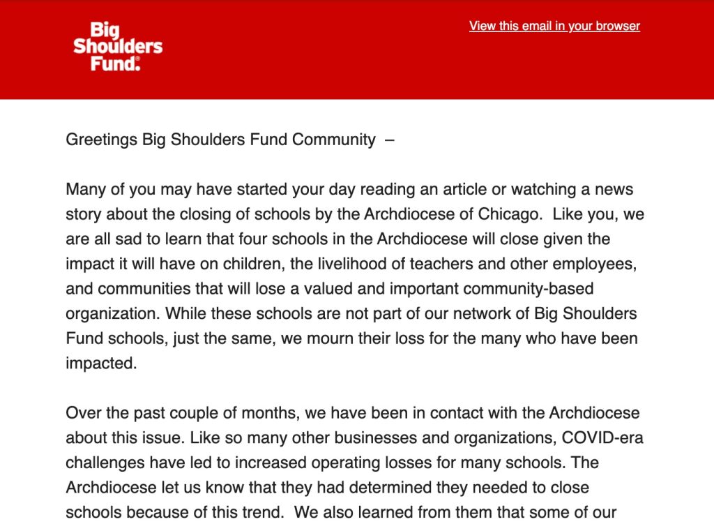
Something very simple, like Big Shoulders Fund’s basic but branded header, works equally well for keeping your brand on point.
At the very least, a well-branded email should include:
- Your nonprofit’s logo
- Your brand’s colors (or similar colors)
- Your brand’s font (or something similar to what’s on your website if you don’t have an official font in your visual brand guide)
- Your contact information
There are some cases where we actually recommend against a fully polished, snazzily branded email. More on that in a future post!
Nonprofit Newsletter Basic Tip #3: Legible Content
“Legibility” is about how difficult or easy it is (physically) to read text or perceive images. Can your eyes physically perceive what is there? Can your brain process it?
Every part of your online presence should utilize legible content…but when it comes to email marketing for nonprofits, legibility is not nice to have. It’s crucial.
Why?
Because for most of us, email is a “complementary activity.” In other words, email is what we do while we’re doing something else. Maybe we’re watching TV, working from home, cooking dinner, attending to our kids…
Whatever the activity is, your email recipient is almost guaranteed to be distracted as they check their inbox. That means you’ll increase the odds of engagement by making sure your nonprofit email newsletter is clear to the eye and physically easy to read.
Legibility requires:
- Clear font: Try to use at least 14px but don’t be afraid to go as high as 18px. Avoid fancy cursive or overly handwritten fonts, except for very large headlines.
- Plenty of white space: Avoid cramping all of your information tightly together, as it becomes overwhelming (especially on small phone screens). Leave generous space between sections for easy reading.
- Color contrast: Make sure that your text contrasts enough with the background. Something like dark gray on light gray can be very difficult to read.
Below is a good example of a legible, well-spaced message with good color contrast.
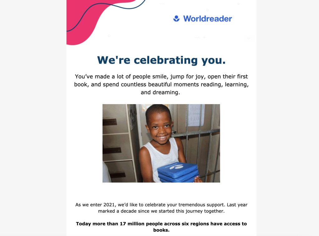
Worldreader puts plenty of space between paragraphs, uses dark colors on a white background, and selectively bolds text for easy reading.
It’s important to check for legibility on both desktop and mobile. What looks perfectly easy to read on a large computer screen might suddenly be extremely challenging on mobile—where roughly 50% of all people are viewing emails.
For instance, look at the screenshot below, taken on my iPhone and now sized to about the same size I saw when I opened it.
This nonprofit newsletter email reads perfectly fine on desktop—and it’s very, very well written—but on the phone, it’s tiny. I can hardly make out the text, and pretty much as soon as I opened it, I closed it.
Too hard to read. And there’s a million other things I can do on my phone instead!
Nonprofit Newsletter Basic Tip #4: Working, Up-to-Date Information
In many cases, having some kind of newsletter is better than none at all. But that may not be true if your nonprofit newsletter is sorely out of date.
Emails that have old years, obviously outdated information, or clearly broken elements may actually hinder the trust and credibility you’re working so hard to build with your community. When I received outdated emails during this experiment, my first thought was to wonder whether these orgs are still active or not.
And if an organization doesn’t seem active, I’m unlikely to contribute my time or money.
At least once or twice a year, it’s worth reviewing your automated email messages to check for:
- Broken links
- Broken images
- References to no-longer-in-existence programs
- Outdated contact information
- Outdated leadership information (names, positions, etc.)
- Outdated years (especially in the copyright in the footer)
The organization below, for example, does awesome work and sent us a very nice welcome email message…but we signed up in 2021, and the email mentions looking forward to 2018.
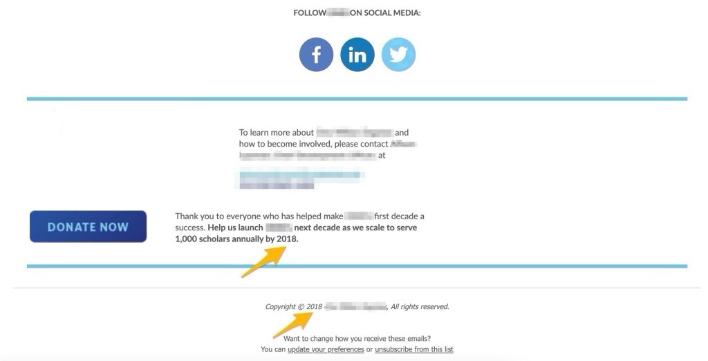
Less importantly but still noticeable, the copyright information is similarly out of date.
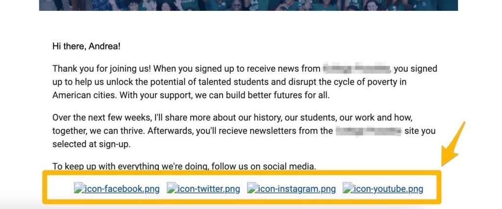
Another nonprofit organization had a terrific welcome email—nicely branded, concise, and personal—but all of the social media links were broken. Unfortunately, because the hyperlinked text is in bright blue, it’s also the most prominent text on the entire page in terms of visual appeal.
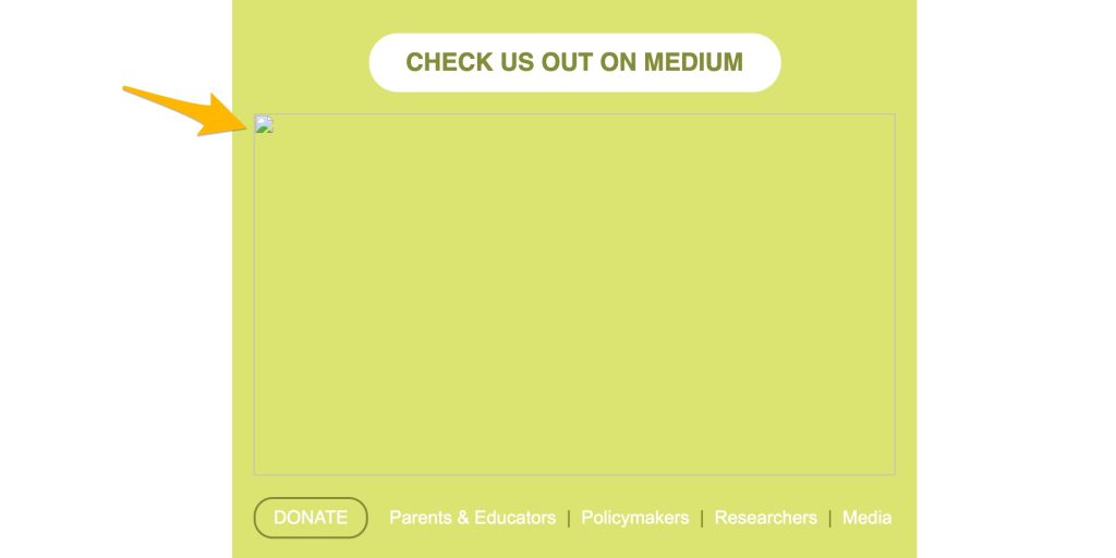
Another organization sent an email encouraging us to check out their writing on Medium, but the largest feature in the nonprofit newsletter email was a broken image file.
Need some help remembering to check and update your emails? Set a reminder in your calendar or email app to review your current email campaigns at least twice a year. If you do quarterly planning for your nonprofit email marketing, that’s a great item to add to your action list.
Nonprofit Newsletter Basic Tip #5: Text-Based Email
Speaking of images…
The last basic tip to keep in mind is to use text-based emails, never pure images.
Several of the nonprofits we signed up for send their emails out as one large image. There’s little to no text; instead, all of the information has been saved into a single JPG or PNG file.
As an example, check out the image below. Obviously this image is WAY scaled down, but we did that on purpose, so you can see just how much of this email is an image: the entire orange box at the top, which represents literally all of the body content.
The 10% that isn’t an image is simply the footer, which is provided by the email marketing platform.
Even with so much blurred out, you can see that this email is well designed—it looks polished and professional. But there are several usability problems with the entire content of the message being saved as a single image.
The most compelling concern is that image-only emails leave many users behind.
People who rely on screen readers (due to visual impairment or another need) will not be able to understand the content of an image-only email. All they’ll “hear” is a blank page. You can partially fix this by creating great alt text for the image, but at that point, why not just create a text-based email?
Accessibility is extremely important, and we’ll cover it in a lot more detail in a later post. If you want to learn more now, we recommend learning more from usability.gov or Kris Rivenburgh’s guide to accessibility on Medium.
A few other problems with image-based emails include:
- Slower load time, making it more likely for the recipient to close out
- More data usage—especially important for people who use pay-as-you-go mobile phone data or who live in a less connected area
- Blocked messages (some email platforms block images by default, so the user will only see the image if they expand it or specifically choose to open it)
Don’t get us wrong!
Images are very important to include in email marketing for nonprofits, and we’ll talk more about them in another post. You just want to avoid sending an email that is 100% (or really even over 50%) image-based.
A good rule of thumb for checking this issue is to purposefully view your email newsletter completely without images. Does it still get your point across? Is all essential information (event, time, date, etc.) still present and clear? If not, add more text until the images are “nice to have” rather than essential.
What’s Next for Your Nonprofit Email Marketing?
Well, that’s it for this list of fundamentals for your nonprofit email newsletter!

Again, we know some of these tips might seem obvious, but we’re highlighting them because we saw them crop up over and over with real email newsletters from real nonprofits.
Just by taking a few minutes to doublecheck the issues above, you’ll be making sure that your nonprofit email marketing campaigns are set up for success—starting from the very first welcome email you send. Whatever you do, please don’t let it be the drab gray default email!
Start with these foundations, and you’re ready for advanced tips on email marketing for nonprofits. More to come on that!