Is it impact report time already?!
If you need to create your nonprofit annual report (and you’ve somehow found your way to this blog post), I’m assuming you could use a little inspiration. No worries; I’ve been there, too, and I’ve got ya covered! In this post, I’m sharing my favorite nonprofit annual report examples—along with some very specific pointers about what makes each one so effective.
Nonprofit Annual Report Examples
This list contains some of our favorite nonprofit annual reports, ranging from quick four-pagers to online-only landing pages to full printed reports of 80 pages and up.
Wild Montana
A gorgeous magazine spread worthy of your coffee table

Wild Montana’s 2020 Annual Report makes use of gorgeous imagery—and for a conservation organization, pictures really do speak volumes! This report clearly showcases what’s at stake and what needs protection.
Here are a few highlights from this report:
- It has a very polished design with thoughtful use of colors, photos, and layout.
- It uses repeated motifs to tie the report together visually, such as the chalk-style divider line, the paper-textured background, and images with the background cut out.
- It uses the landscape orientation, which is uncommon in nonprofit annual reports and works well with the stunning imagery and wide landscape shots.
- They use very short headlines to keep the text easy to read and visually simple.
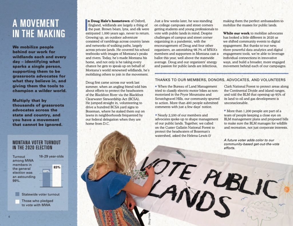
The only thing that’s missing in my opinion? A table of contents. Because this report is over 15 pages long, I would expect to see a table of contents to help readers understand and navigate it better.
AIDS Foundation Chicago (AFC)
The (all-online) impact report with the splashiest and snazziest animation
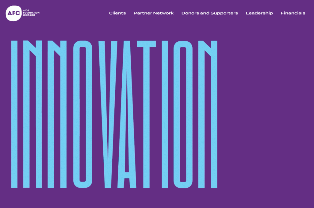
The AIDS Foundation of Chicago is the perfect example of a growing trend: nonprofit impact reports that are all online. This organization takes it one step further by featuring a creative animation at the top of their 2020 annual report. (I will say that some people might find the animation difficult to read—but it’s definitely professionally done!)
A few other notable points about this online impact report:
- Because everything is on a single web page, there’s no need to view a PDF through a separate website or worry about downloading anything.
- The organization makes great use of design motifs, including hand-drawn decorative marks, organic cut-out shapes, and colored photo overlays.
- This nonprofit annual report displays tons of statistics throughout the page.
- They keep the page easy to scan and well divided by using large headlines and alternating various background colors.
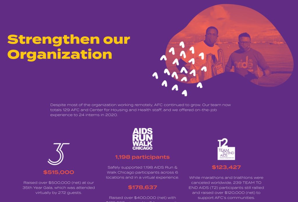
If I had to be picky about anything, I’d say that the body font could be a little thicker. It’s so thin (and uses such wide-set letterforms) that I doubt this would pass accessibility checks. People with low vision might not be able to read this report.
Mayan Families
A multilingual nonprofit impact report with an awesome cover
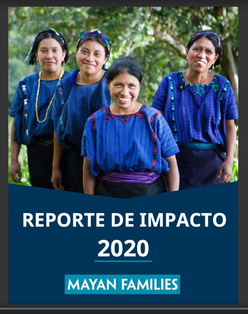
Does your nonprofit serve speakers of different languages? Then take a page out of the Mayan Families book and create an annual report in all of the languages you primarily serve!
This organization has compiled one annual report in English and one annual report in Spanish—both designed to match the nonprofit’s brand and share the wonderful work they’re doing. If you have the resources to do so, multilingual support is a wonderful way to meet your audiences where they are.
Some other things I really like about these annual reports include:
- Really nice use of color palette, incorporating bright colors drawn from traditional fabric without becoming overwhelming
- Vibrant and engaging cover photo featuring four smiling women
- Nicely organized content sections including summaries of 2020 and plans for 2021 in each of their programming areas
- A map at the very beginning of the nonprofit annual report, making their work more tangible
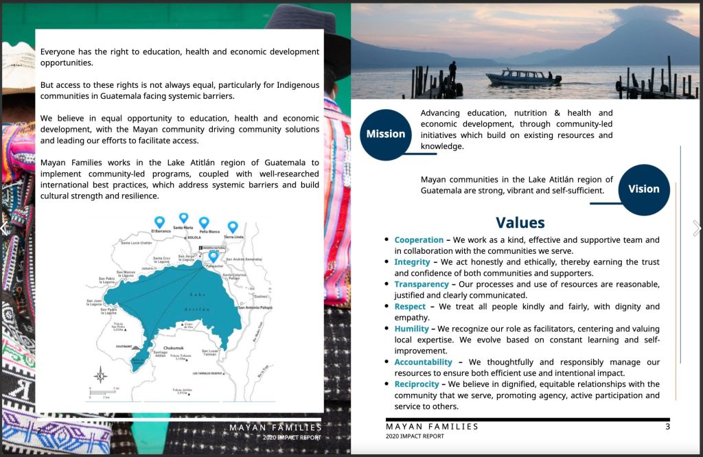
If I were to make one recommendation for this organization from a graphic designer’s point of view, it would be to switch away from justified text and toward left-aligned text (also called “ragged right”). This would prevent some of the awkward text spacing that you can see in the example image below.
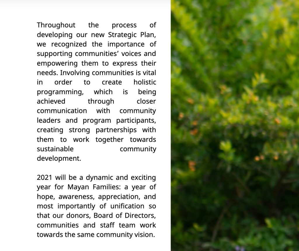
Native Governance Center
A simple, easy-to-read online report with a very powerful cover photo
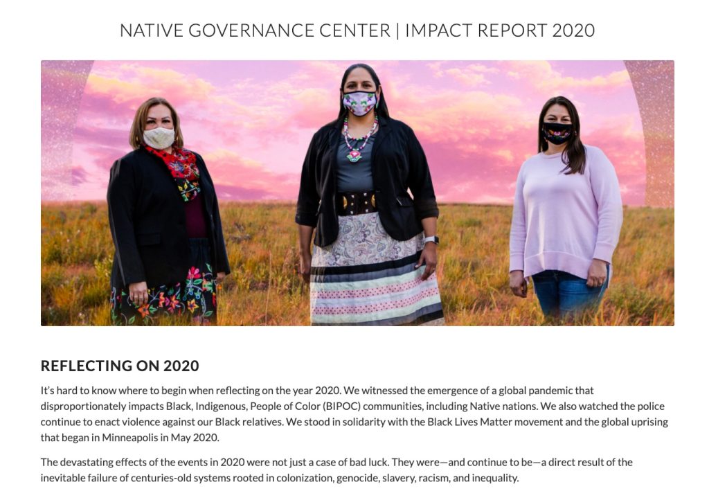
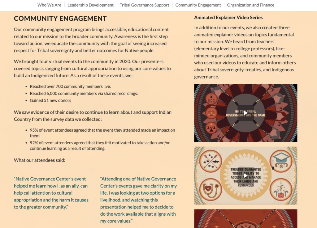
The Native Governance Center is another example of an online-only nonprofit impact report. Compared to the extremely long report from the AIDS Foundation of Chicago, I’d say this version is a bit more realistic for many nonprofits. It’s detailed and information-rich but not so long and complex that it couldn’t be done in house.
Other things that are awesome about the Native Governance Center’s 2020 annual report:
- Amazing choice of cover photo—powerful, serious, professional, and still friendly
- Great use of statistics
- Simple but well-implemented color scheme
- Includes embedded explainer videos
- Includes a call to action button at the end (one of the great things about having a web page version of the annual report)
Community Foundation of Louisville
A beautiful nonprofit annual report design without a single photograph
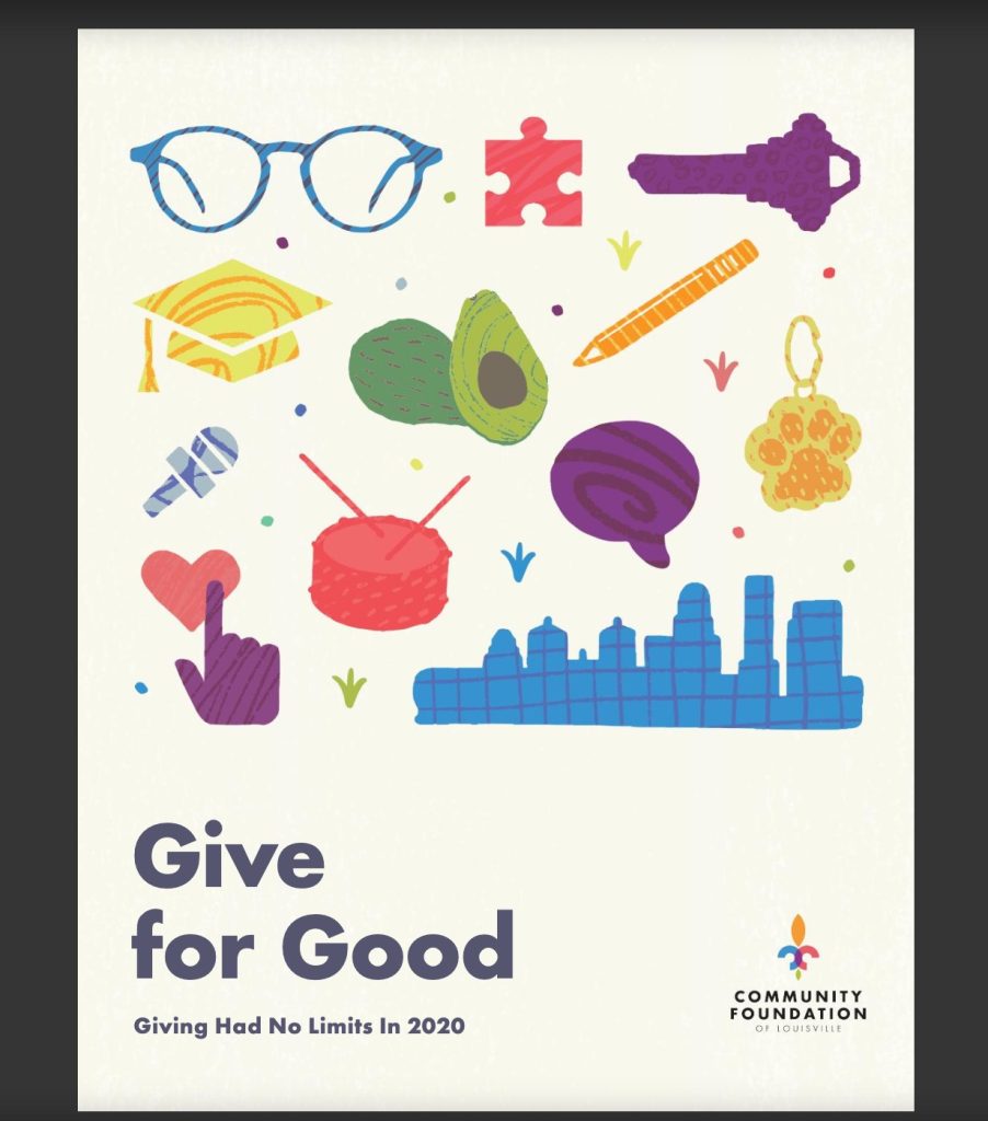
Alright… so your nonprofit doesn’t have the stunning images that Wild Montana does? Have no fear! The Community Foundation of Louisville does an excellent job with their 2020 annual report—without a single photo to be had.
Instead of images, this organization uses a series of illustrations with a quirky, hand-drawn style that adds plenty of character. If you don’t have many photographs to use, this is a great example to follow.
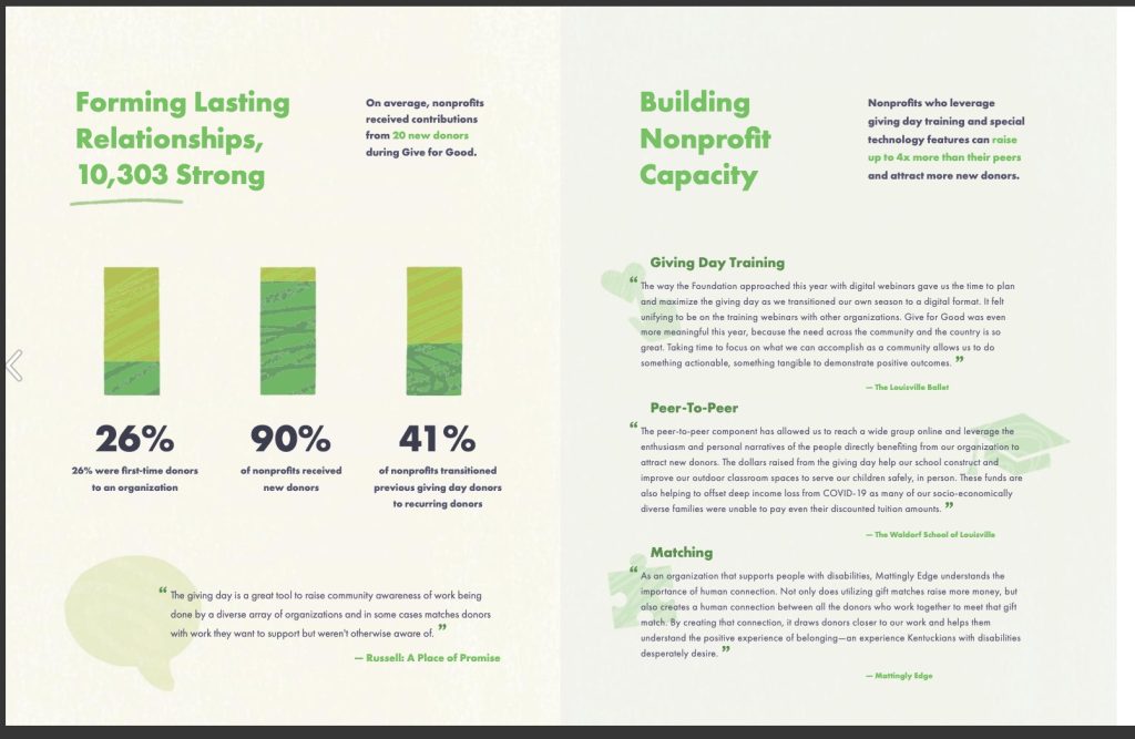
Other points I love about this nonprofit annual report:
- Bright and varied color scheme, implemented well
- Excellent use of large statistics—12 different stats in just 8 pages
- Lots of white space in the design with plenty of room to breathe
- Creative use of textures, such as the bars in the bar chart shown below
Center for Urban Families (CFUF)
Powerful color scheme and typography with awesome focus on personal stories
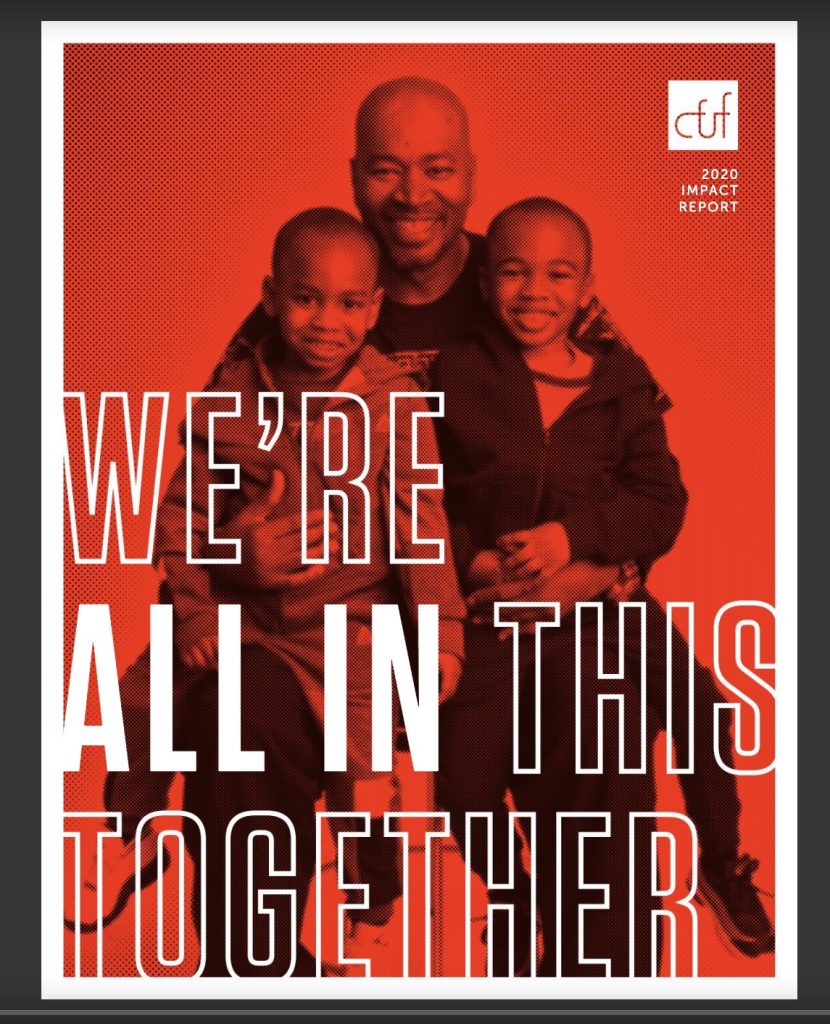
The Center for Urban Families shows that nonprofit impact reports can be just as visually impactful as the work they do. I mean, couldn’t you see the cover image above as a Nike ad? It’s powerful, friendly, and empowering—plus the writer in me loves the play-on words.
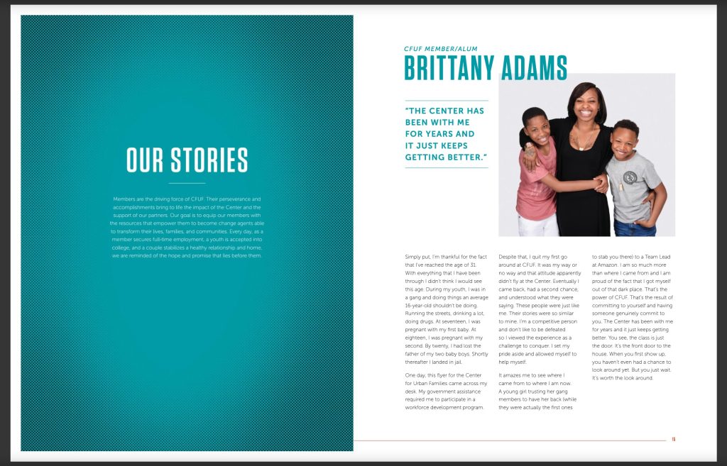
What else is great about this CFUF nonprofit annual report? Lots of things, but here are some highlights:
- Clean layout with plenty of white space and easy-to-read columns
- Consistent use of color, type, and brand messaging
- Fantastic use of stories from all kinds of people: members, alumni, partners, board members, and staff
- Focus on including the reader in the message with key headlines like “Together we can do more”
Cycling UK
A great example of a very long impact report that’s still easy to read
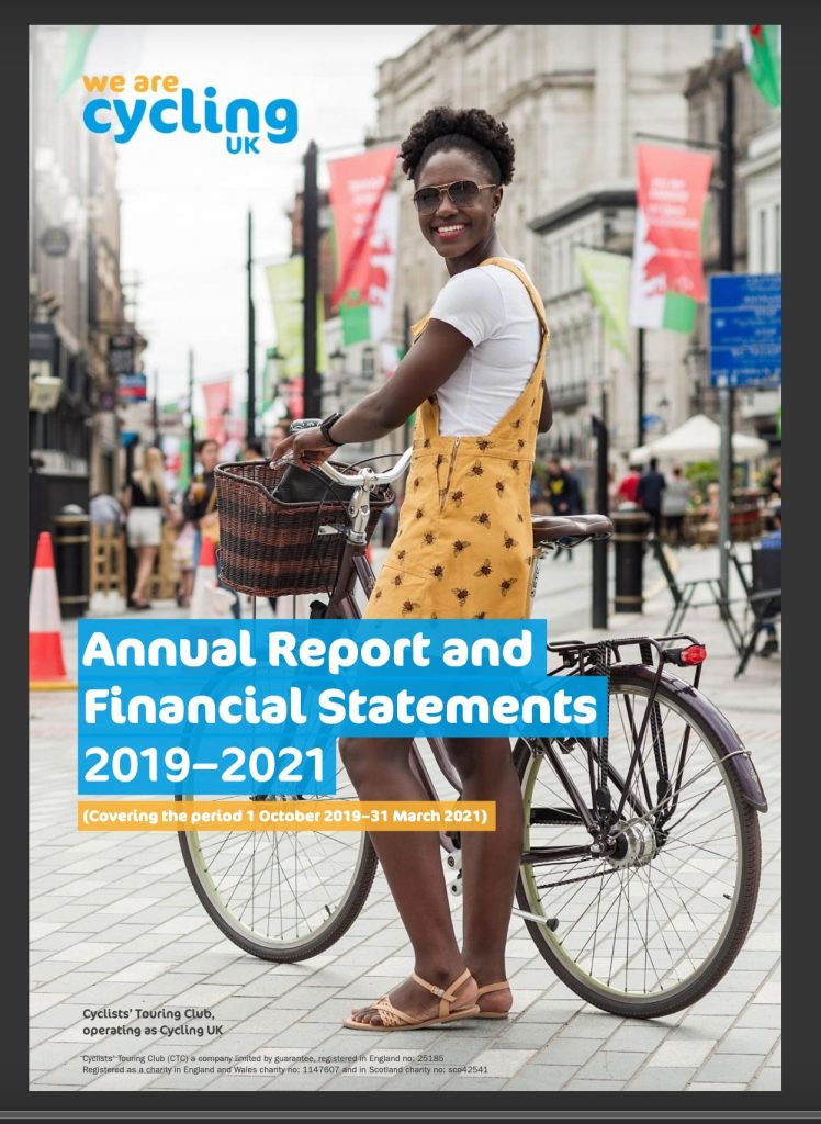
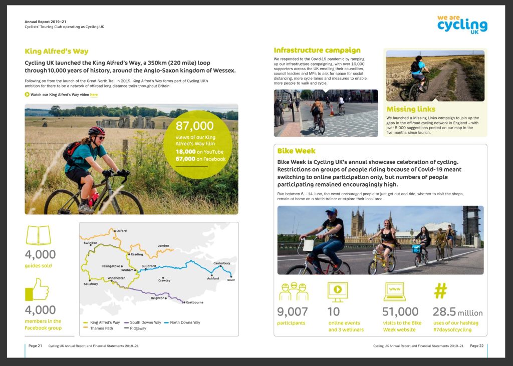
If you’re a large nonprofit with many distinct geographic locations and programming initiatives, then Cycling UK is the perfect example to follow. This nonprofit annual report is a whopping 81 pages long—probably because it combines the typical annual report information with financial statements and notes required by UK law.
Despite the length, the impact report is still very easy to read and well organized overall. I especially love the:
- Table of contents—definitely necessary for such a long report!
- Page for organizational values, featured prominently in the inner cover
- Excellent use of branded color scheme throughout the document
- Great use of statistics with icons for easy scanning
- Good incorporation of COVID-19 and the unique challenges of 2020
- Creative use of maps, which are important to a group of cyclists
100 Black Men
The perfect way to show appreciation to sponsors (plus excellent storytelling!)
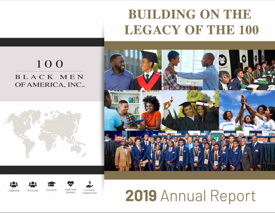
Do you have a lot of sponsors to include in your nonprofit impact report? 100 Black Men of America, Inc. has taken a fantastic approach.
Instead of listing sponsors in a basic list at the end of the report, they’ve highlighted sponsors within the stories they tell (see the screenshot below for an example). This is a great way to show sponsors just how much work they’re helping you accomplish—and to give them a place of prominence that makes them feel appreciated.
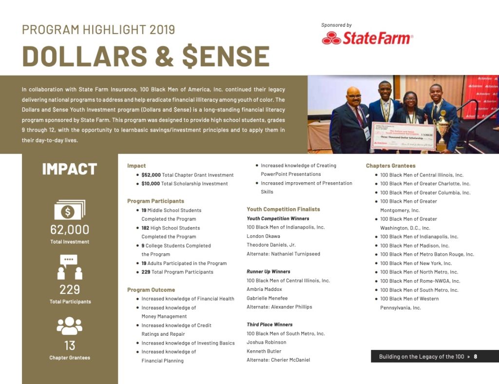
Here are a few other things that this impact report example does well:
- Tons of testimonials, stories, and case studies sprinkled throughout the report
- Simple color scheme that’s on brand and easy to read
- Liberal use of bullet points for easy scanning of program activities and results
- Wonderful variety of photos including portraits, group photos, action shots, etc.
- Use of a logo cloud to show sponsors—more visually interesting than a list
Tips for Creating Your Nonprofit Annual Report
As you can see from the nonprofit annual report examples above, there are a million ways to design an awesome report—which I guess is part of the challenge, right? It’s hard to narrow down what your report should look like and what it should contain when there are so many right ways to do it.
As you design your impact report, keep these tips in mind:
- Spend some time choosing an impactful cover photo—you don’t get a second first impression!
- Weave high-quality photos throughout the report if you have them. You can also add some pizzazz by using royalty-free photos as background elements—try websites like Pexels or Unsplash.
- Don’t forget the table of contents if you’re creating a long report. (If you’re making an electronic version, you can hyperlink to the pages for even easier navigation.)
- If you’re making an online-only report, make sure that it’s easy to navigate in a browser. Make sure that the table of contents isn’t hidden, and there aren’t too many scrolling sections within scrolling sections, which can become frustrating to use.
- For an online nonprofit annual report, make use of the medium! Add animations, interactive maps, embedded videos, and links to really make the most of the digital format.
- Consider having your report translated if you serve multilingual audiences. This can really demonstrate that you value all of your people.
- When in doubt, add more stories! Personal stories are one of the most effective ways to create a nonprofit brand that people remember. You can tell stories about your board, staff, volunteers, participants, and more.
- Not sure how to make your impact report cohesive? Try to create a theme! Choose a few words that really embody your nonprofit’s year—maybe resilience for 2020—and then use synonyms, idioms, and imagery around this theme.
- Make each report unique. Highlight what made this year different and what you’ve learned to take into the next year. You don’t want your nonprofit annual reports to sound the same year after year.
- Sprinkle statistics throughout the report. These not only provide easy scanning, but they can also break up a page visually.
Bonus tip: Once your report has been created, don’t forget to share it! You can send it out in your nonprofit newsletter, share it on social media, and link to it throughout your website. (Since funders may look for your impact report along with your financials, it’s a good idea to keep these items in one easy-to-find place on your site, too.)
Annual Report Must-Haves: A Quick Checklist
Before I go, I want to finish this article with a quick checklist for your nonprofit annual report. Before your design is finalized and sent off to print (or to be posted on your website), make sure that it has these items:
✓ An opening message—often a brief letter from the ED or a short summary paragraph
✓ Summary/highlights of individual programs during the year
✓ Statistics or other information to express program results
✓ Stories, quotes, or case studies to connect with the audience
✓ Anything especially unique to happen this year—some interesting challenge, leadership change, global pandemic, etc.
✓ Some kind of vision, plan, or message for the upcoming year
✓ Summary of financials
✓ A thank you to donors—often listed out by name and/or giving level
✓ A call to action—how can readers learn more, donate, or join you?
Let’s see… what else? In terms of design, I recommend including as many photos as possible and adding even more white space than you think necessary. In terms of copywriting, try to make sure that you’re speaking in a reader-centric way, using “you” and making the reader feel important to your work. A good rule of thumb is start from a place of, “Here’s what we did together this year,” rather than, “Here’s what our nonprofit did for you.”
That’s it! With these nonprofit annual report examples and tips in mind, I hope you’ll feel a little more inspired to get started on yours.
How does your org create its nonprofit annual report? Do you have any tips to share?